Day 3 - Module 09 Heatmap
UM Bioinformatics Core
2022-03-15
1 [Breakout Exercise 1] - Heatmap of top genes
15 Minutes
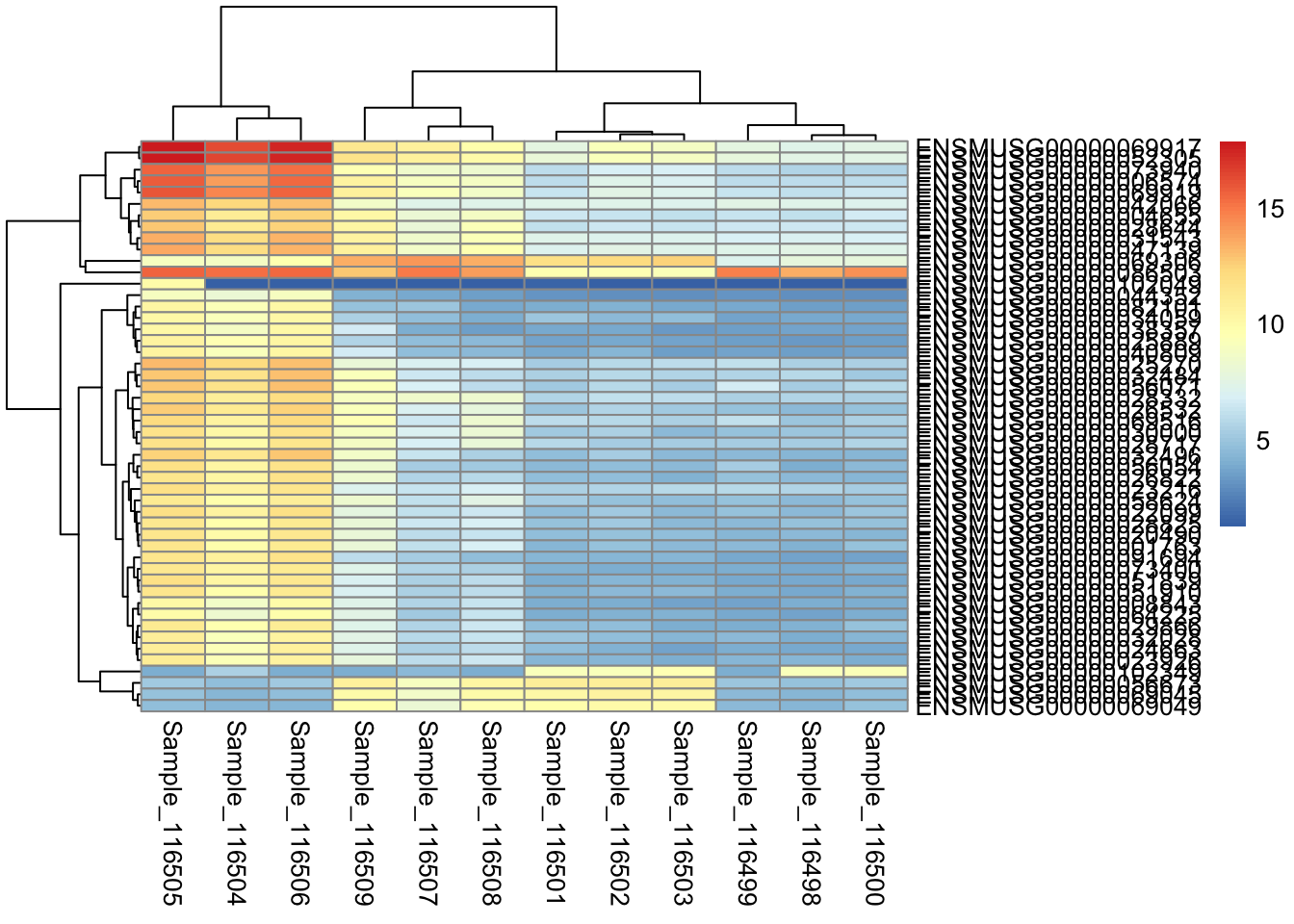
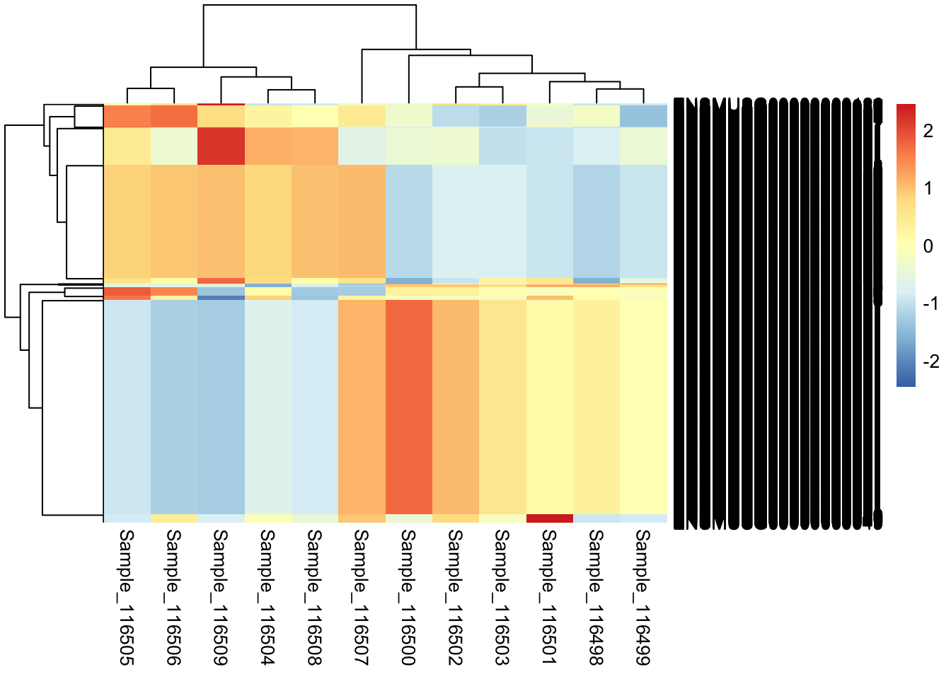
It can be useful to visualize to visualize how our samples organize along with the expression pattern of individual genes. We will create a heatmap of the top most variable genes using the pheatmap function.
1.0.1 Instructions:
- One group member should share their screen in the breakout room. If nobody volunteers, a helper may randomly select someone.
- The group members should discuss the exercise and work together to find a solution.
- If there is time after a solution is found, allow all members to complete the exercise.
- First, create a object named
topVarGenesthat stores the top 50 most variable genes from our rlog normalized data (note that each row ofrldcorresponds to a gene). - Work from the inside to the outside when stringing together commands and test out each part to ensure the commands you enter are having the expected behavior.
Hint:
The command
rowVars(assay(rld))will return the row variance values, the commandbase::orderwill return an index of the input re-arranged into accending or decending order, and theheadcommand or index referencing can be used to select the firstor last part of several data types.
Click for solution
Helpers - it may be helpful to guide learners through testing the steps needed to select the top 50 most variable genes. The below example is one possible solution.
topVarGenes = rowVars(assay(rld))
head(topVarGenes)
## [1] 0.008608561 1.734191622 0.037923016 0.114943172 0.019207105 0.149559602orderedVars = order(topVarGenes)
head(orderedVars)## [1] 16161 18665 18695 18933 19009 19034sortedVars = sort(topVarGenes)
head(sortedVars)## [1] 0.0005250999 0.0008457552 0.0008457552 0.0008457552 0.0008457552 0.0008457552tail(sortedVars)## [1] 11.10653 14.23099 14.42485 14.67978 15.49938 15.74445?order
orderedVars = order(topVarGenes, decreasing = TRUE)
head(topVarGenes[orderedVars])## [1] 15.74445 15.49938 14.67978 14.42485 14.23099 11.10653orderedMat = assay(rld)[orderedVars, ]
head(orderedMat)## Sample_116498 Sample_116499 Sample_116500 Sample_116501 Sample_116502
## ENSMUSG00000069917 7.386969 7.592002 7.421841 7.658291 9.096951
## ENSMUSG00000052305 7.545034 7.866700 7.553335 7.999982 9.158207
## ENSMUSG00000073940 5.660694 5.948358 5.642725 6.041644 6.784668
## ENSMUSG00000006574 5.924567 6.076577 6.030227 5.926847 7.300111
## ENSMUSG00000069919 6.208442 6.407137 6.469322 6.382475 7.472736
## ENSMUSG00000032496 4.325376 4.451341 4.396189 4.708752 5.339877
## Sample_116503 Sample_116504 Sample_116505 Sample_116506 Sample_116507
## ENSMUSG00000069917 8.744320 16.24134 17.75598 17.41340 10.595285
## ENSMUSG00000052305 8.866311 16.38642 17.87966 17.49616 10.639776
## ENSMUSG00000073940 6.828258 14.15300 15.68239 15.25716 8.527179
## ENSMUSG00000006574 6.957638 14.03874 15.81059 15.51719 8.937274
## ENSMUSG00000069919 7.135661 14.57034 15.92302 15.70450 9.120502
## ENSMUSG00000032496 4.540770 11.33823 12.53432 12.74284 6.293183
## Sample_116508 Sample_116509
## ENSMUSG00000069917 9.845426 11.396878
## ENSMUSG00000052305 10.043313 11.651572
## ENSMUSG00000073940 8.288975 9.536873
## ENSMUSG00000006574 8.833479 10.522213
## ENSMUSG00000069919 8.615545 10.586671
## ENSMUSG00000032496 5.519366 8.619501#
orderedMat = orderedMat[1:50, ]
## Alternatively
orderedMat = head(orderedMat, 50)- Next, use
pheatmapto plot the selectedtopVarGenesfromrld. If you have time, try to scale by row to enhance any clusters of genes with similar expression across samples.
Hint:
We can use
assay(rld)to access the matrix of normalized data and we can use bracket notation ([rows,]) and the list of rows stored intopVarGeneto only provide data for the 50 genes of interest.
Click for solution
# plot with no arguments
pheatmap(orderedMat)
# plots with row scaled and assigned to 'p' to make writing to file easier
p <- pheatmap(assay(rld)[topVarGenes,], scale = "row")
Note, as mentioned in this Biostars post, scaling by row in pheatmap will automatically scale the data to Z-scores.
Finally, to output the plot to file, use the pdf() function:
pdf(file = paste0(plotPath, 'Top_heatmap_rlog_', Comparison, '.pdf'), onefile = TRUE)
p
dev.off()
## quartz_off_screen
## 2