PCA and Integration
UM Bioinformatics Core Workshop Team
2025-10-16
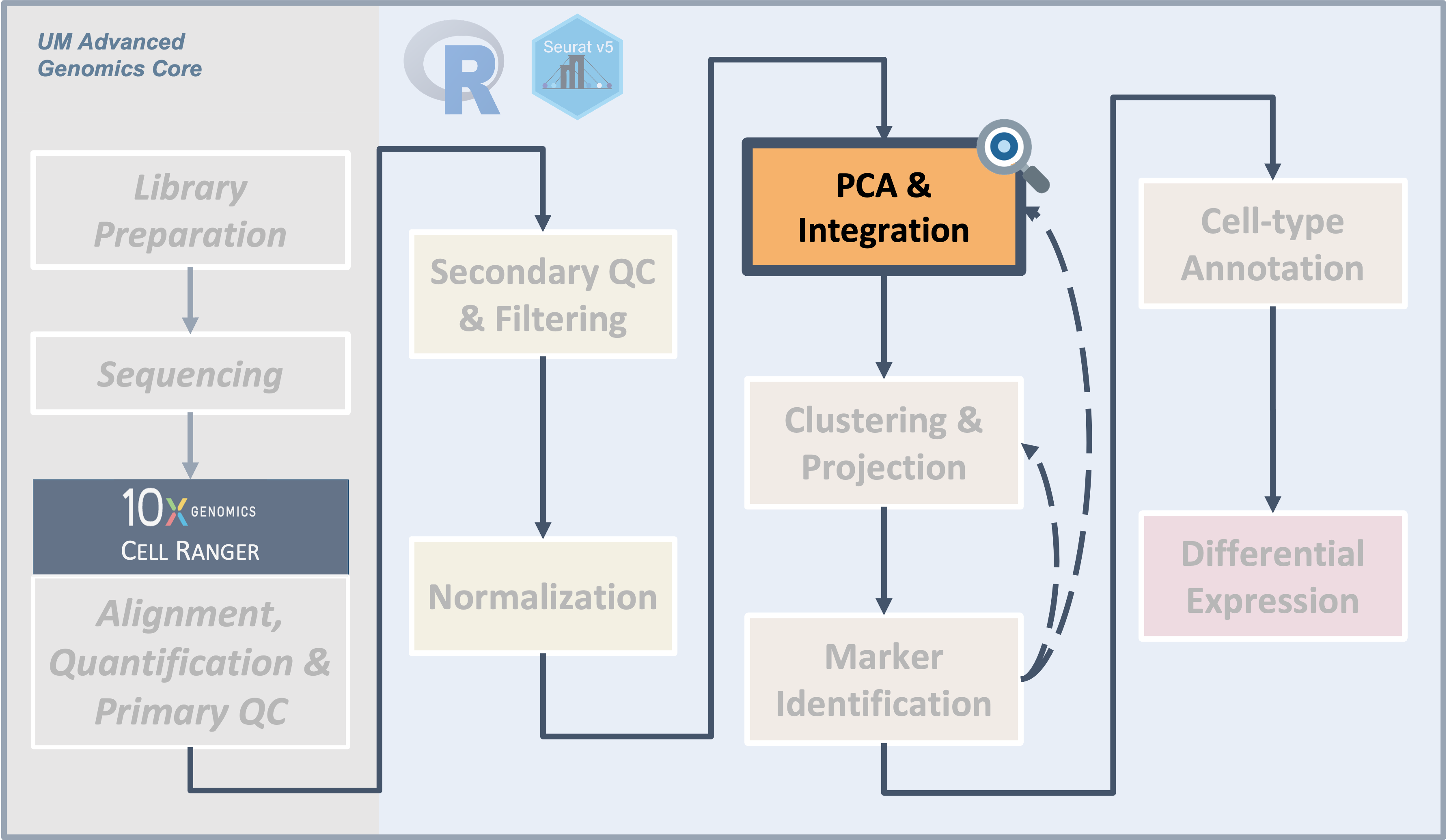
Introduction
|
| Starting with filtered, normalized data [gene x cell] for all samples - principal component analysis (PCA) can be used to reduce the dimensionality while still representing the overall gene expression patterns for each cell |
After filtering and normalization, our next goal is to cluster the
cells according to their expression profiles. However, even after
filtering, we expect to still have several thousand cells assayed with
approximately 21,000 genes measured per cell. This means that we are
working very “high-dimensional” data that presents some challenges.
Objectives
- Understand why PCA is used prior to integration and clustering for
single-cell data
- Use the
RunPCA()function to generate principal components for our data
- Use
IntegrateLayers()to integrate our sample data prior to clustering
Similar to the previous sections, while we will be showing one example of executing these steps and you may see only a single approach reported in a paper, testing multiple methods or parameter options might be necessary.
What is PCA?
The high dimensionality of single-cell data present two major challenges for analysis:
- The scale makes analysis steps costly and slow
- The sparseness means there is likely uninteresting variation that should be excluded
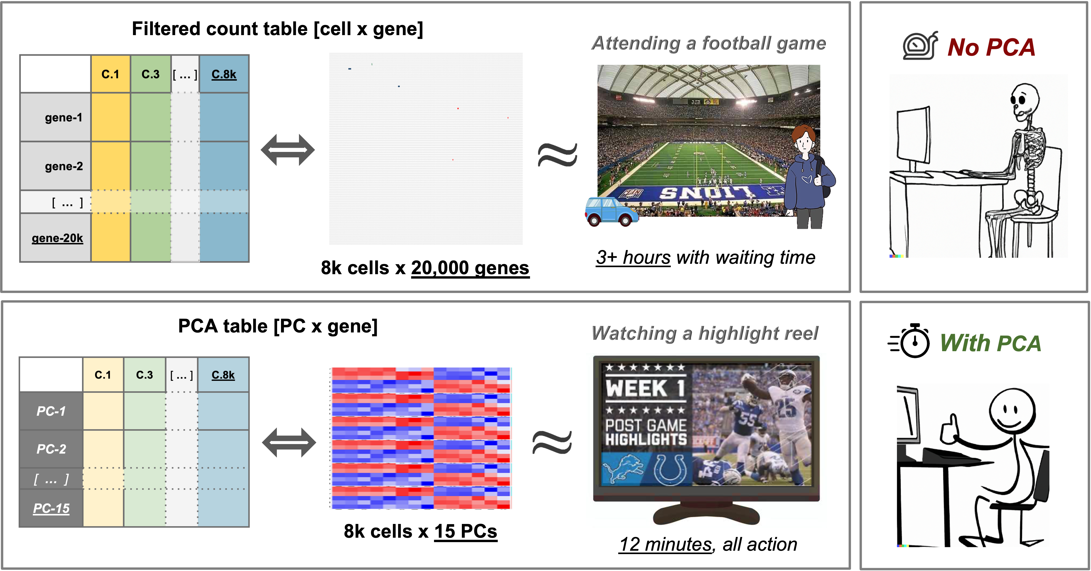
In practical terms, Principal component analysis (PCA) creates a simpler, more concise version of data while preserving the same “story”. For example, a football game is exciting to attend in person but can take hours, especially considering the time spent traveling and waiting. Conversely, watching a highlight reel of the same game might not give you the full experience, but by seeing the key plays conveys what happened in the game in a fraction of the time.
Similarly to a highlight reel, running PCA allows us to select PCs that represent correlated gene expression to reduce the size and complexity of the data while still capturing the overall expression patterns and also reducing computation time.
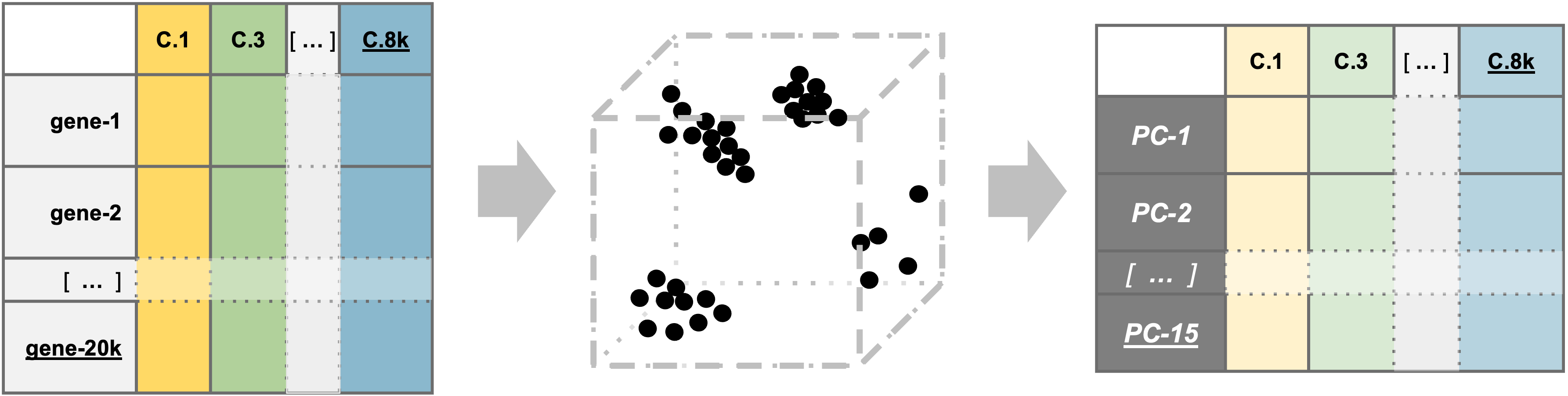
PCA example
To understand how PCA works for single-cell data, we can consider a smaller dataset measuring the expression of four genes measured in just two cells and plot the expression of those four genes, with data from one cell plotted on the x-axis and the second cell plotted on the y-axis.
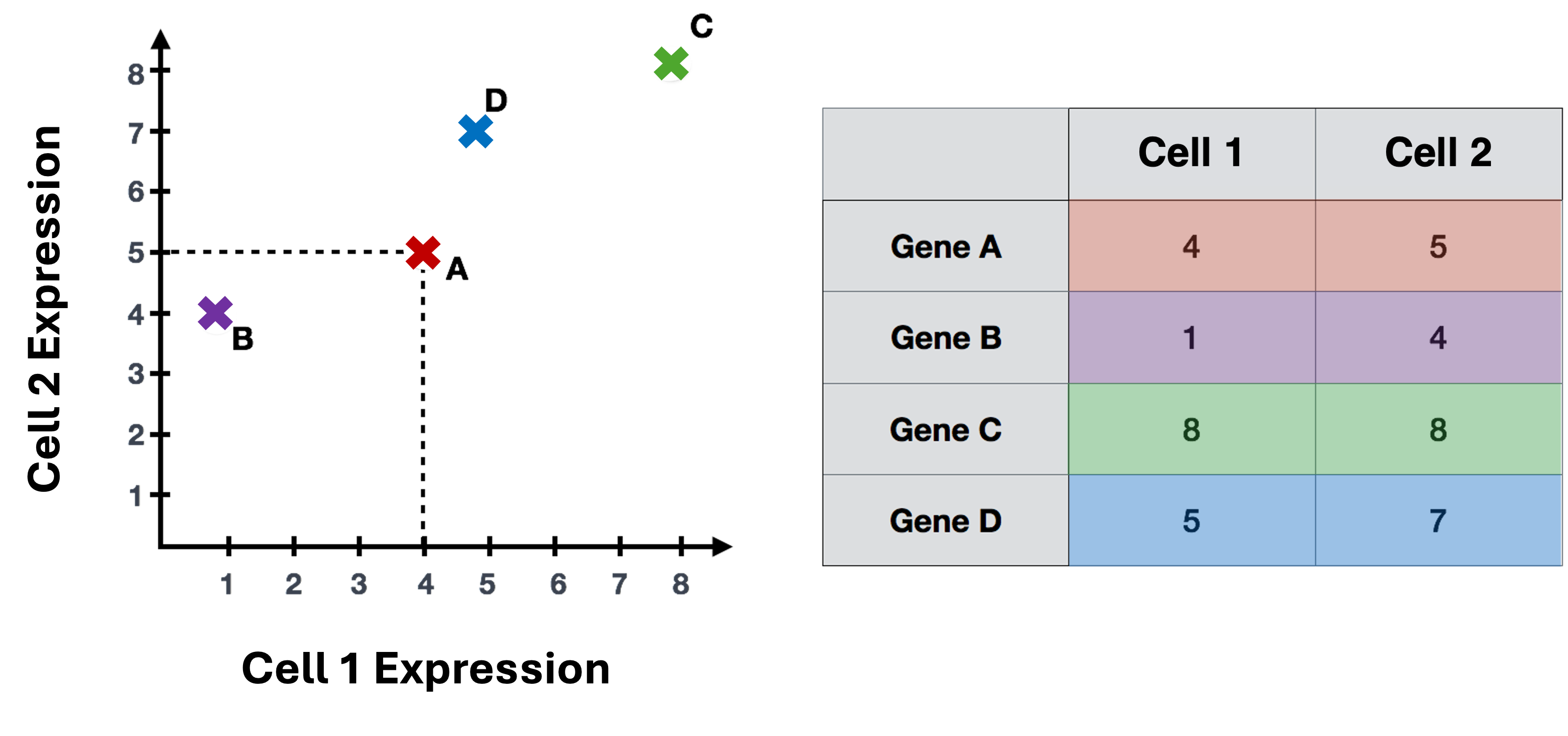
If we wanted to represent the most variation across the data, we would draw a diagonal line between gene B and gene C - this would represent the first principal component (PC). However, this line doesn’t capture all the variance in this data as the genes also vary above and below the line, so we could draw another line (at a right angle to the first) representing the second most variation in the data - which would represent the second PC.
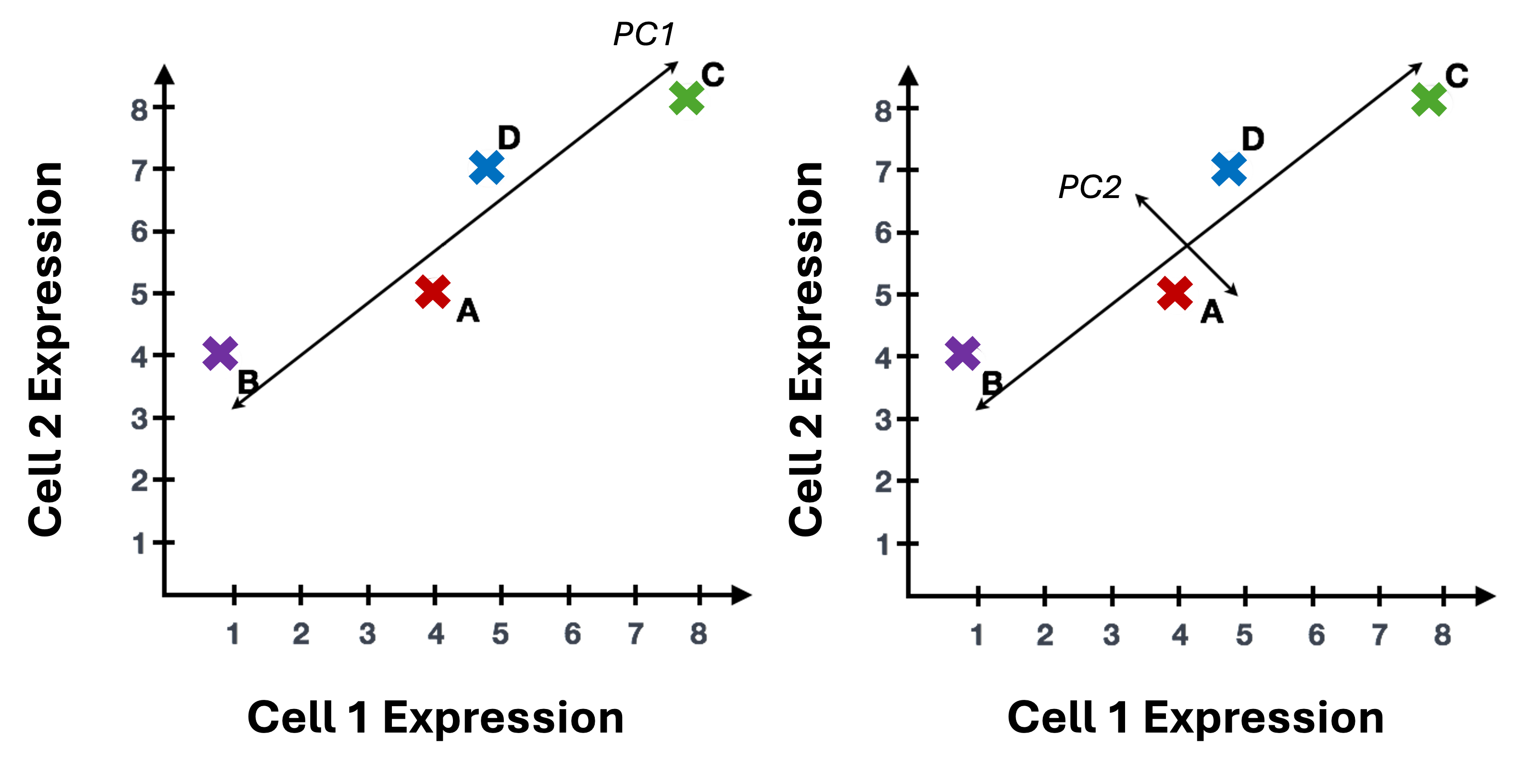
We won’t illustrate the process of generating all possible PCs, but running PCA on our data will result in a score for each cell for each PC and each gene will have a weight or loading for a given PC. By definition, the PCs capture the greatest factors of heterogeneity in decreasing order in the data set (source).
Why PCA is useful for single-cell data
In contrast to bulk RNA-seq, where the majority of the variance is usually explained by the first and second PC, for single-cell data we expect that many more PCs are contributing to the overall variance.
Sparsity in single-cell data
In addition to being “high-dimensional”, we expect the data to be both “sparse” and “noisy”. Sparse in the sense that many genes will either not be expressed or not measured in many of the cells and have zero values. Noisy due to biological variability and technical variability due to the practical limitations of both capture and sequencing depth.
Note on zero “inflation” of single-cell data
Single-cell data is sometimes described as “zero inflated”, however work by Svensson has challenged that characterization and argued that the higher number of zeros observed in scRNA-seq compared to bulk RNA-seq is more likely due to biological variance and lower sequencing saturation than technical artifacts. Work by Choi et al. (2020) support that zeros in single-cell data are due to biology but Jiang et al. (2022) delves more into the “controversy” zero inflation, including common approaches for handling zeros and the downstream impacts.
For sparse, high-dimensional, biological data, we expect many genes to have correlated expression as they would be impacted by the same biological process while other genes to have either low (more noisy) or have similar expression and therefore are not as important for identifying cell-type/subtypes. So we can use the top several PCs to approximate the full data set for the purpose of (source).
More detail on dimensionality reduction
The OSCA book has a chapter on Dimensionality reduction that has useful context.
More context using PCA for single-cell data
To read more on PCA, please refer to the HBC - Theory of PCA content, from which this section is adapted and the original source material for that content, specifically Josh Starmer’s StatQuest video.
For additional detail on , the OSCA chapter on Principal components analysis includes a more descriptive overview.
Run PCA on our dataset
Since PCA is sensitive to scale, we will use the SCT normalized
assay. We will name the reduction in an informative way to keep them
clear for us in the future. In this case, our data has not yet been
integrated, but it has been SCT normalized. So we will name the
reduction unintegrated.sct.pca. Note that
SCTTransform() returned a set of highly variable genes, and
the RunPCA() function will use this subset to determine the
PCs and genes associated with those PCs.
# =========================================================================
# PCA and Integration
# =========================================================================
# Build a PCA and add it to the Seurat object
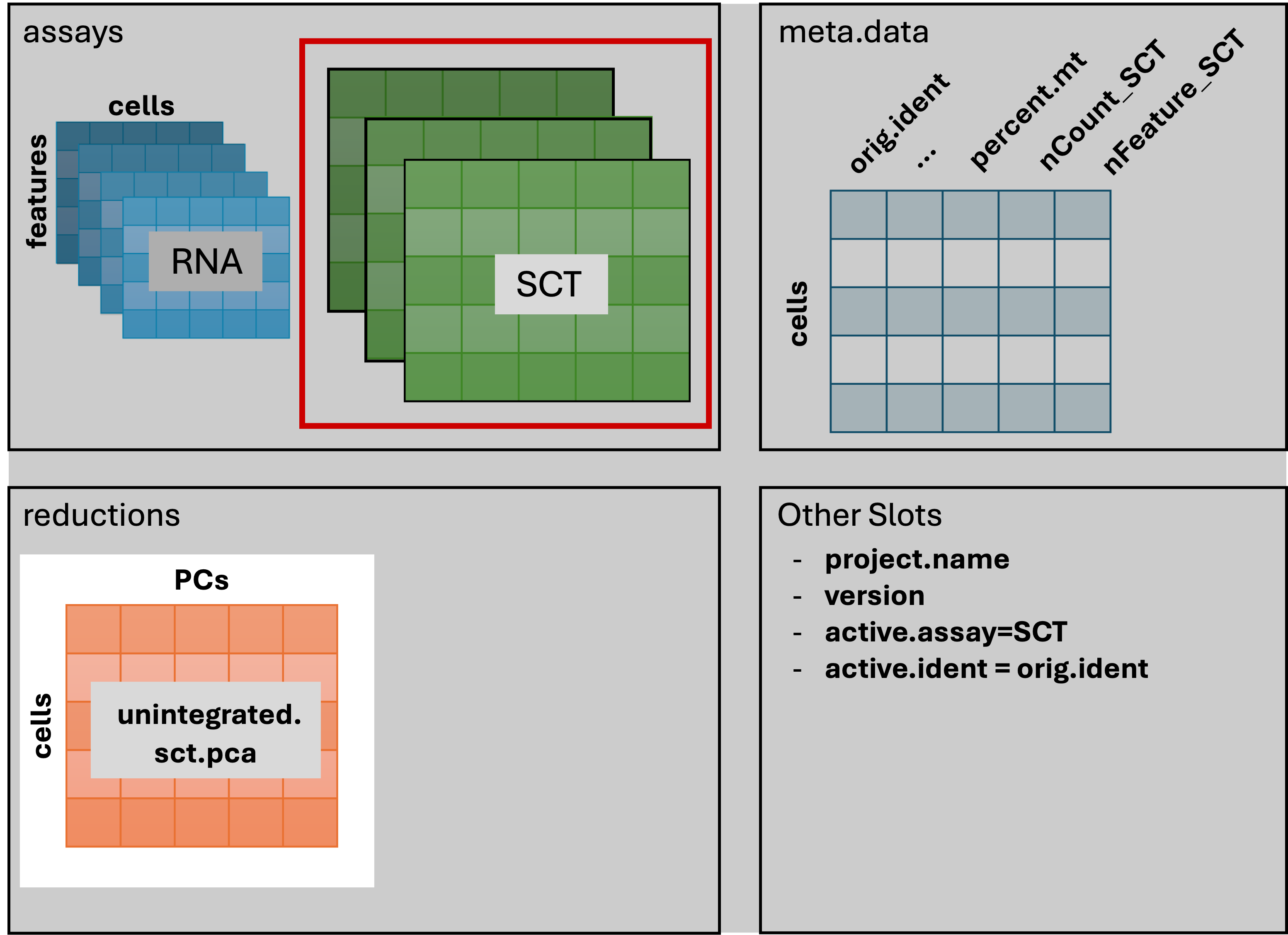
geo_so = RunPCA(geo_so, reduction.name = 'unintegrated.sct.pca')
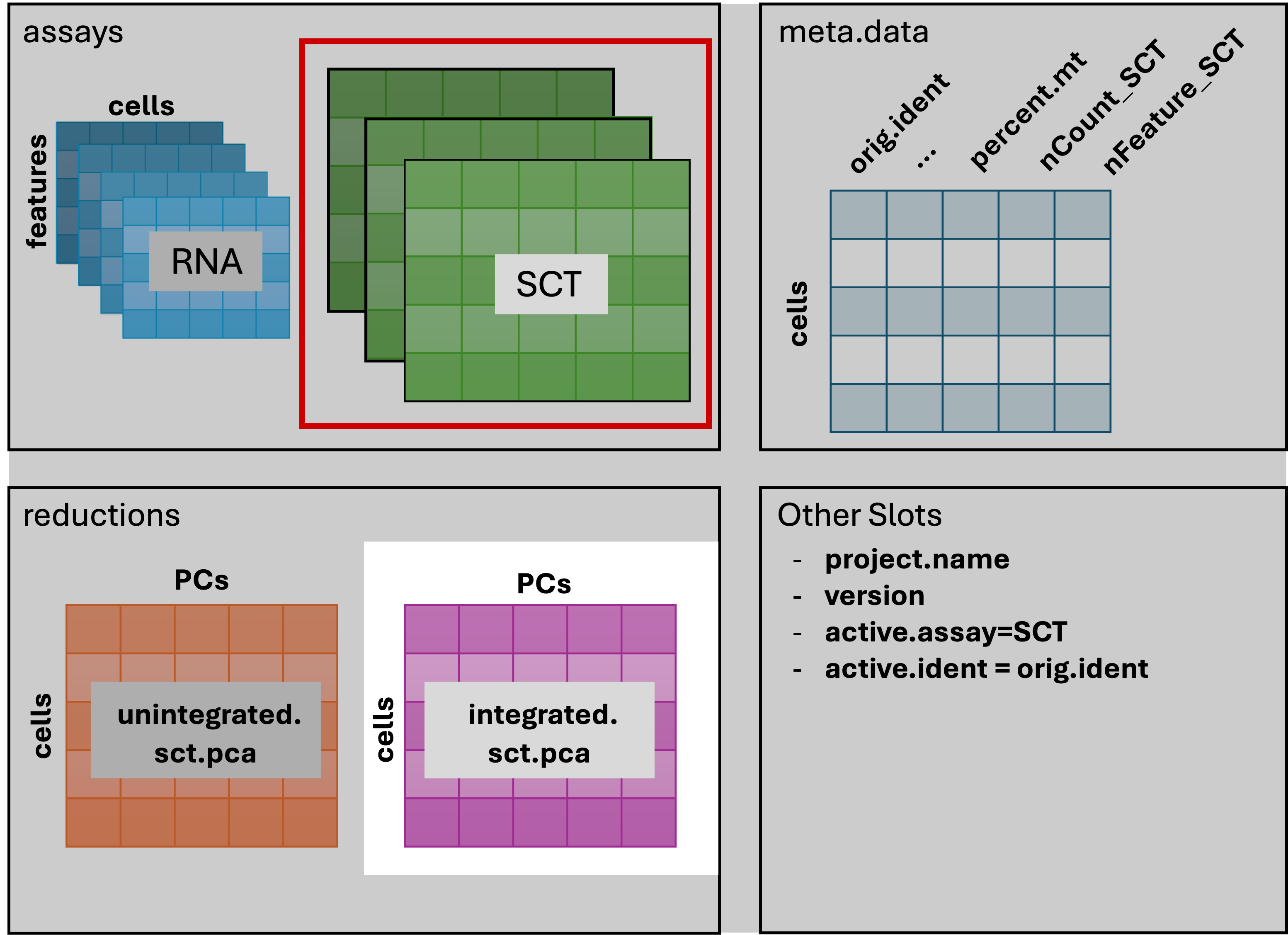
geo_soAn object of class Seurat
46957 features across 31559 samples within 2 assays
Active assay: SCT (20468 features, 3000 variable features)
3 layers present: counts, data, scale.data
1 other assay present: RNA
1 dimensional reduction calculated: unintegrated.sct.pcaAfter running the command in the console, we should see that
geo_so has a new reduction added to that slot in the Seurat
object as shown in the schematic:
We can then visualize the first several PCs using the
DimHeatmp() function, which orders both cells and features
(genes) according to their PCA scores and allows us to see some general
patterns in the data. Here we will specify that the first 24 PCs be
included in the figure and that 500 cells are randomly subsetted for the
plot. Note - you may need to increase your plot window size to
resolve errors regarding figure margins.
# -------------------------------------------------------------------------
# look at first PC alone first
heatmap_1 <- DimHeatmap(geo_so, dims=1, cells=500, balanced=TRUE, fast = FALSE, reduction = 'unintegrated.sct.pca') # doesn't include which PC(s) are included in plot
heatmap_1 +
  labs(title="PC1: top 30 genes x top 500 cells") +
  theme(plot.title = element_text(hjust = 0.5, face = "bold"))

# save to file
ggsave(filename = 'results/figures/qc_pca_heatmap-pc1.png',
       width = 6, height = 4.5, units = 'in')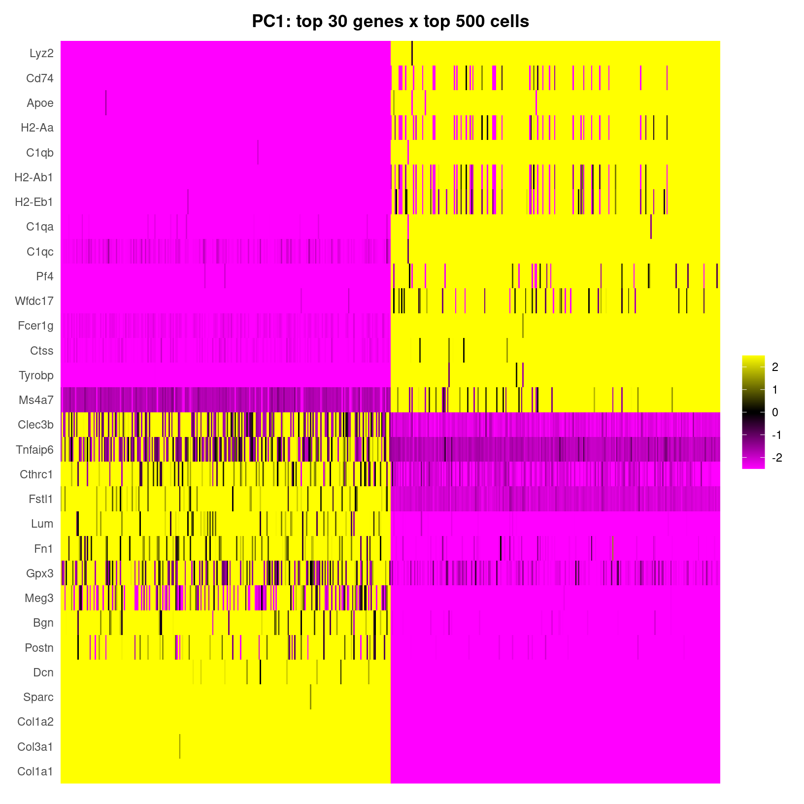
DimHeatmap for PC1 alone
| A heatmap of only the first PC |
|---|
fast=FALSE our output is a
ggplot object, which allows for customization like adding a
more informative, formatted title. Inspired from figures in Dave-Tang’s
Blog: Getting started with Seurat.
|
What about the other PCs that have been calculated for these data? We
can look at additional dimensions using the same
DimHeatmap() function. However, we’ll use the default
plotting where fast=TRUE so base plotting will be used
instead of ggplot.
#  -------------------------------------------------------
# plot cell by gene heatmaps for larger set of dimensions
DimHeatmap(geo_so, dims=1:18, cells=500, balanced=TRUE, combine = FALSE, reduction = 'unintegrated.sct.pca')

# need to use png() to write to file because this isn't a ggplot
png(filename = 'results/figures/qc_pca_heatmap-pc1-18.png', width = 12, height = 30, units = 'in', res = 300)
  DimHeatmap(geo_so, dims=1:18, cells=500, balanced=TRUE, reduction = 'unintegrated.sct.pca')
dev.off()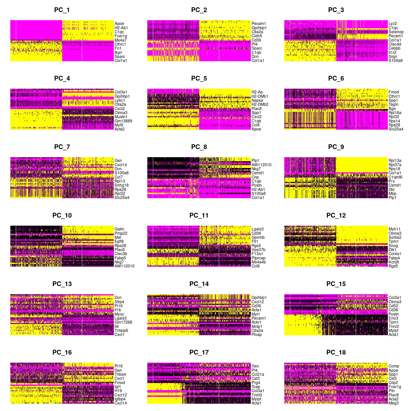
DimHeatmap for PC1 alone
png
  2
As we scroll down in this plot, we see less and less structure in our
plots and more zero scores (in black) indicating that less variation is
being represented by larger PCs overall. However, these patterns can be
hard to see so we can also select a few PCs to take a closer look at,
again using the default fast=TRUE option to generate a base
plot.
# ------------------------------------------------------------
# Plot cell by gene heatmaps for a subset of dimensions
DimHeatmap(geo_so, dims=c(1,5,10,20,30,50), cells=500, balanced=TRUE, reduction = 'unintegrated.sct.pca', nfeatures=20)

png(filename = 'results/figures/qc_pca_heatmap-select.png', width = 12, height = 10, units = 'in', res = 300)
  DimHeatmap(geo_so, dims=c(1,5,10,20,30,50), cells=500, balanced=TRUE, reduction = 'unintegrated.sct.pca', nfeatures=20)
dev.off()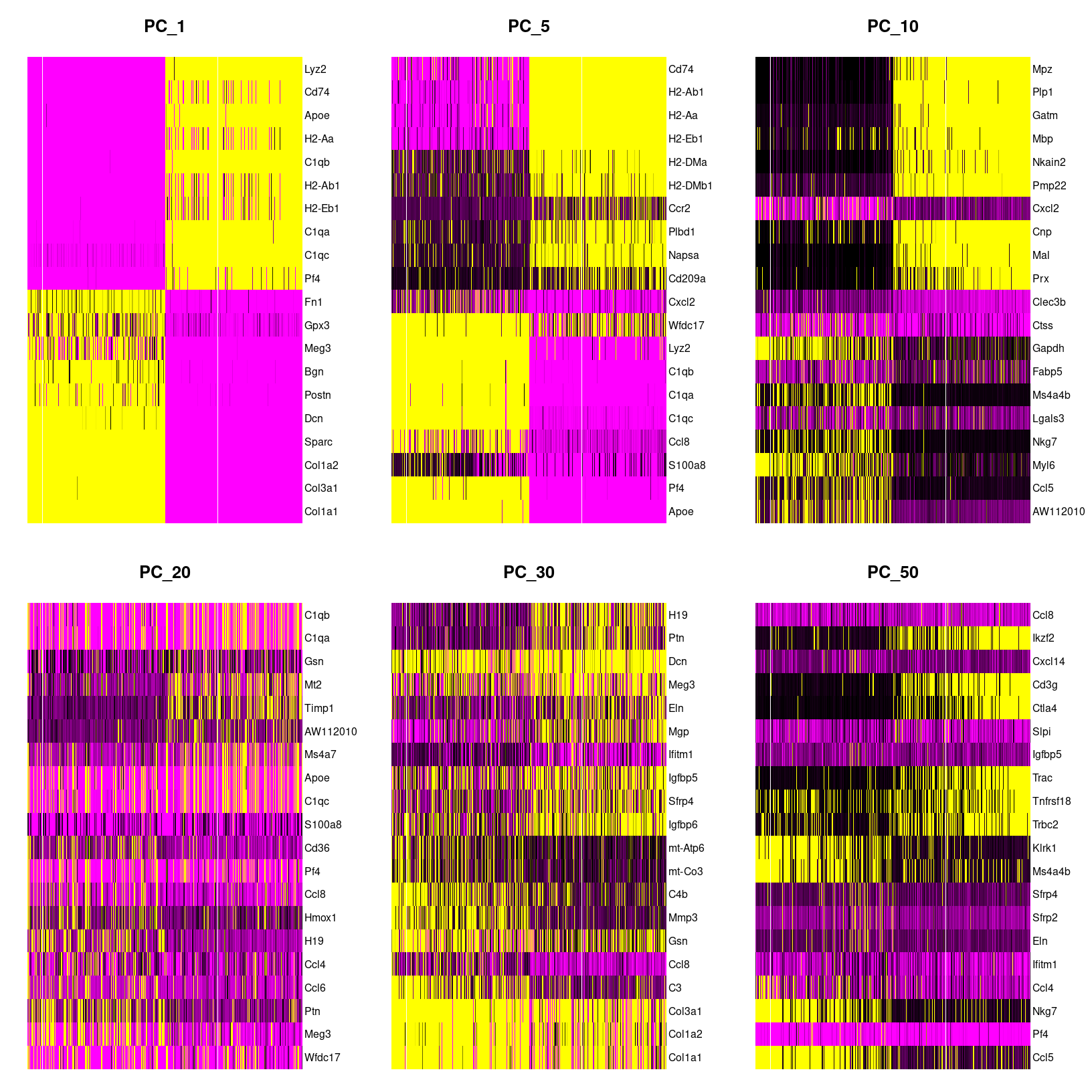
DimHeatmap for select PCs
png
  2
When we look at the selected PCs, we can see a blocky structure for PC10 for about half the cells for a subset of genes. For the later PCs, we are seeing less ‘blocks’ suggesting that the variation explained by these later components might not correspond to the larger cell-type differences that important for clustering.
What genes are contributing the most to each PC?
We can also visualize the loadings for genes contributing to each principal components using Seurat provided functions source.
We can highlight genes loaded for dimensions of interest using using
VizDimLoadings():
# -------------------------------------------------------------------------
# Visualize gene loadings for PC1 and PC2
VizDimLoadings(geo_so, dims = 1:2, reduction = 'unintegrated.sct.pca')
ggsave(filename = 'results/figures/qc_pca_loadings.png',
       width = 12, height = 6, units = 'in')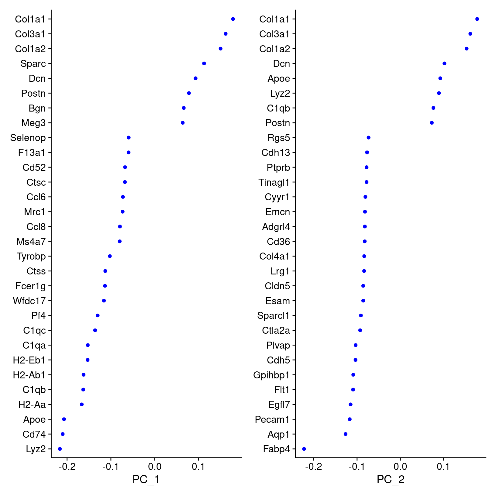
How does Seurat use PCA scores?
Per the Ho Lab’s materials - “To overcome the extensive technical noise in any single feature for scRNA-seq data, Seurat clusters cells based on their PCA scores, with each PC essentially representing a ‘metafeature’ that combines information across a correlated feature set. The top principal components therefore represent a robust compression of the dataset.”
Visualizing our PC results
While we’ll discuss selecting the number of PCs to use for clustering
in the next section, it be useful to visualize the first 2-3 PCs.
Similarly to how we use PCA plots bulk RNA-seq, we can see if there
might be batch effects or other technical variation contributing to the
components representing the top overall variance by using the
DimPlot() function, with each cell plotted along the
selected PCs and colored by a selected meta-data column:
?DimPlot # default dims = c(1,2)# -------------------------------------------------------------------------
# Visualize PCA (PC1 and PC2, unintegrated)
# first label by sample
DimPlot(geo_so, reduction = 'unintegrated.sct.pca', group.by = 'orig.ident')
# then label by day, which looks more useful
DimPlot(geo_so, reduction = 'unintegrated.sct.pca', group.by = 'time')
# save plot labeled by day
ggsave(filename = 'results/figures/qc_pca_plot_unintegrated_sct_day.png',
width = 7, height = 6, units = 'in')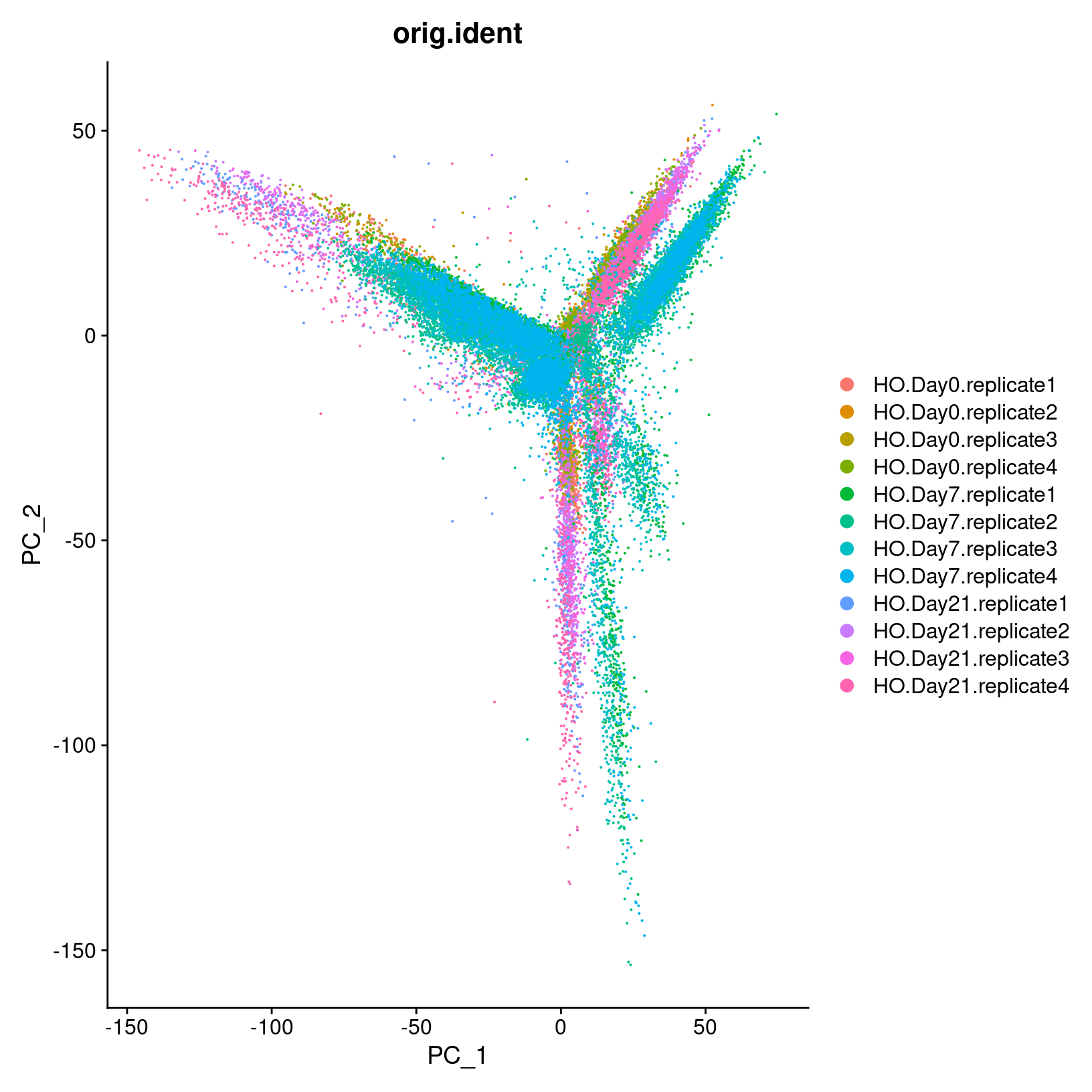
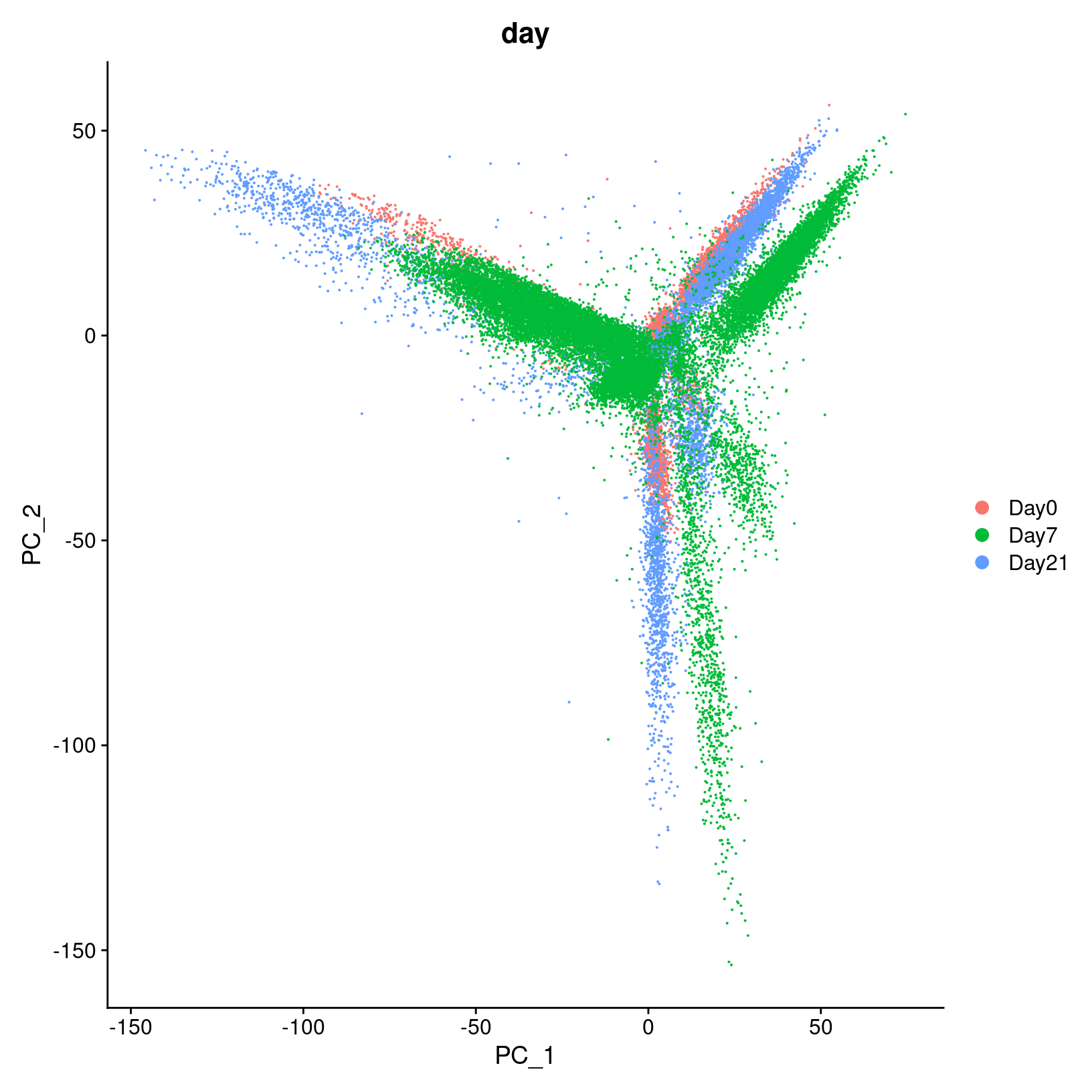
In the first plot with each cell labeled by the original sample name,
it looks like there might be some batches but it’s hard to distinguish.
From the second by day, we can see that even after
normalization there seems to be variation that corresponds more to a
batch effect related to the day status than interesting biological
variation. This suggests that clustering our data using our selected
number of PCs, integration should be performed to mitigate these
differences and better align our data.
Integrate Layers
Before proceeding with clustering, we want to integrate our data
across all samples. This is a common step for scRNA-seq analyses that
include multiple samples and should mitigate the differences between
samples we saw in our PCA plot. Currently, each sample is stored as a
layer in our geo_so object. Since earlier in the workshop,
we used SCTransform() to normalize our data, select
variable genes and then have generated a PCA reduction, we’ll use the
IntegrateLayers() function.
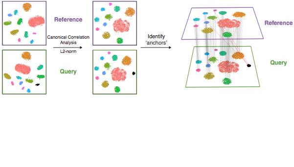
The details of how integration works depends on the method, but for the RPCA approach that we’ll be using here - the process is similar to the canonical correlation analysis (CCA) approach illustration above (source). However, RPCA is more efficient (faster) to run and better preserves distinct cell identities between samples (source). As described in the corresponding Seurat tutorial, each dataset is projected into the others’ PCA space and constrain the anchors
New to Seurat v5 are improvements that make selecting different
integration methods much easier. The results of each alternative
integration method are stored within the same Seurat
object, which makes comparing downstream effects much easier. So, if we
wanted to run the RPCAIntegration method, we would run
(but we won’t here):
### DO NOT RUN ###
geo_so = IntegrateLayers(
  object = geo_so,
  method = RPCAIntegration,
  orig.reduction = 'unintegrated.sct.pca',
  normalization.method = 'SCT',
  new.reduction = 'integrated.sct.rpca')
### DO NOT RUN ###
Note that the integration is run on the layers, which from our prior
steps each correspond to a single sample, in our geo_so
Seurat object. For additional information, refer to the Seurat v5
vignette on integrative analysis (link)
provides examples of each integration method. Note, that the Seurat
vignette code uses the NormalizeData(),
ScaleData(), FindVariableFeatures() pipeline,
so their IntegrateLayers() call does not include
normalization.method = 'SCT', as ours must.
Load a pre-prepared integrated data file:
Because the IntegrateLayers() function takes a while to
run, we will load the RPCA integrated geo_so object from a
file we have previously generated.
# -------------------------------------------------------------------------
# Load integrated data from prepared file
geo_so = readRDS('inputs/prepared_data/rdata/geo_so_sct_integrated.rds')
Note we have specified the unintegrated reduction
unintegrated.sct.pca, which is what
IntegrateLayers() operates on, along with the
SCT assay. Let’s take a look to see what’s different about
the Seurat object:
# -------------------------------------------------------------------------
# Check our updated object that we've read in from file
# Observe that we now have a new reduction, `integrated.sct.rpca`
geo_so
An object of class Seurat
46957 features across 31559 samples within 2 assays
Active assay: SCT (20468 features, 3000 variable features)
3 layers present: counts, data, scale.data
1 other assay present: RNA
2 dimensional reductions calculated: unintegrated.sct.pca, integrated.sct.rpcaAnd in in our running schematic, we can now see
integrated.sct.rpca added to the dimensional reduction
slot:
We can also confirm that our integration method has helped to correct
the Day effects we saw in the initial PCA plots by
generating a similar plot for our integrated data.
# -------------------------------------------------------------------------
# Visualize PCA (PC1 and PC2, integrated)
DimPlot(geo_so, reduction = 'integrated.sct.rpca', group.by = 'time')
ggsave(filename = 'results/figures/qc_pca_plot_integrated_sct_day.png',
       width = 7, height = 6, units = 'in')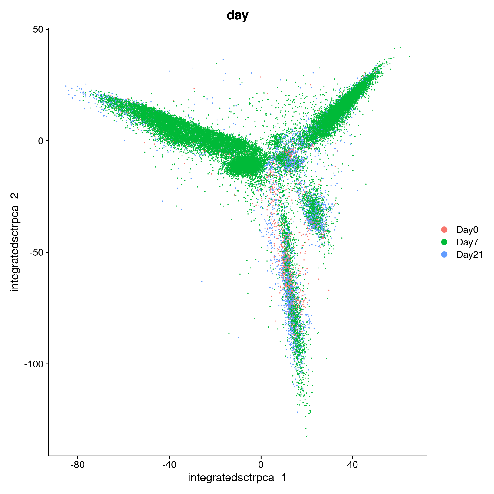
Remove plot variables once they are saved
Plots are terrific for visualizing data and we use them liberally in our analysis and the workshop. Interestingly, ggplots save a reference to the source dataset - in our case a rather large Seurat object. That’s ok in most cases, BUT if you save your RStudio environment (or RStudio temporarily suspends your session), RStudio will save a separate copy of the Seurat object for each ggplot object; RStudio’s simplistic approach avoids a lot of complexity, but can drastically increase your load time and memory usage.
Since (a) we have the script to recreate the plots and (b) we explicitly saved them as graphic objects - we can simply remove them from memory.
# -------------------------------------------------------------------------
# Remove plot variables from the environment to avoid excessive memory usage
plots = c("heatmap_1")

# Only remove plots that actually exist in the environment
rm(list=Filter(exists, plots))
gc()
used (Mb) gc trigger (Mb) max used (Mb)
Ncells 6617674 353.5 12351777 659.7 12351777 659.7
Vcells 374293824 2855.7 795005255 6065.5 760364303 5801.2Save our progress
Before we move on, let’s save our updated Seurat object to file:
# -------------------------------------------------------------------------
# Save updated seurat object to file
saveRDS(geo_so, file = 'results/rdata/geo_so_sct_integrated.rds')
Other integration methods
After normalizing the data with
SCTransform()and performed the dimension reduction withRunPCA(), alternatively we could also use theCCAintegration method with:### DO NOT RUN ### geo_so = IntegrateLayers( object = geo_so, method = CCAIntegration, orig.reduction = 'unintegrated.sct.pca', normalization.method = 'SCT', new.reduction = 'integrated.sct.cca') ### DO NOT RUN ###
Summary
|
|
| Starting with filtered, normalized data [gene x cell] for all samples - principal component analysis (PCA) can be used to reduce the dimensionality while still representing the overall gene expression patterns for each cell |
In this section, we:
- Discussed how PCA is used in scRNA-seq analysis.
- Demonstrated some visualizations after computing PCA.
- Integrated the data.
Next steps: Clustering and projection
These materials have been adapted and extended from materials listed above. These are open access materials distributed under the terms of the Creative Commons Attribution license (CC BY 4.0), which permits unrestricted use, distribution, and reproduction in any medium, provided the original author and source are credited.
| Previous lesson | Top of this lesson | Next lesson |
|---|