Clustering and Projection
UM Bioinformatics Core Workshop Team
2025-10-16
Workflow Overview
Introduction
|
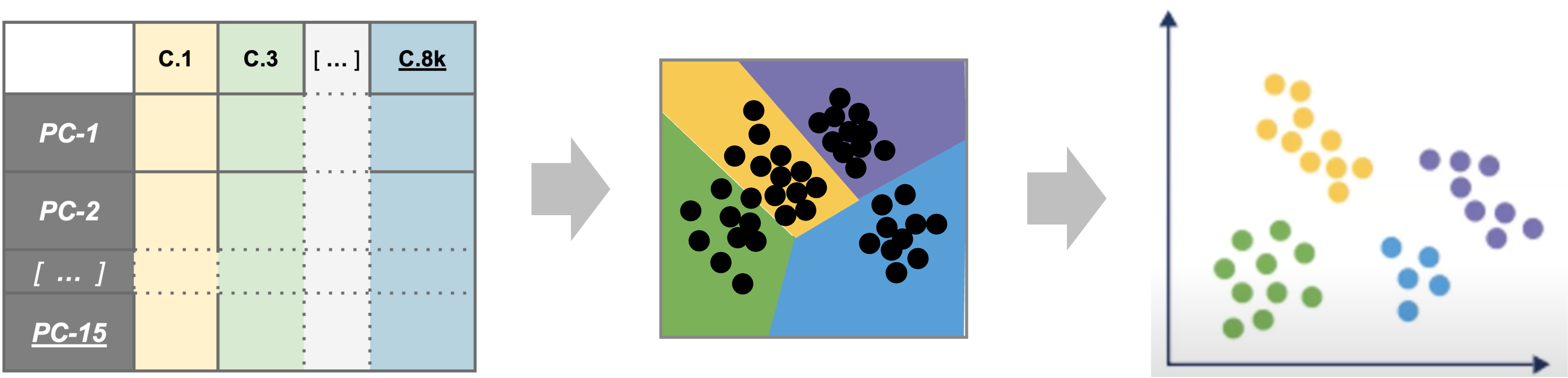
| Starting with reduced dimensionality data [PCs x cells] for all samples - cells are organized into networks and then split up to into clusters with similar expression programs, regardless of experimental condition. |
Before making any comparisons between experimental conditions, its
important to identify cell-types or sub-types present across all samples
and unsupervised clustering is a reasonable starting point to accomplish
this.
Objectives
- Choose an appropriate number of principal components to represent
our data
- Understand the clustering process and input parameters
- Generate initial clusters using
FindNeighbors()andFindClusters() - Visualize our clustering results with
DimPlot()
Like other steps in our analysis, multiple parameters may need
to be tested and evaluated while we would expect that only the final
would be reported. Clustering is considered part of data exploration so
an iterative approach is common (OSCA).
Clustering and projection
Now that we generated a PCA reduction of our data and integrated across samples/batches, our next task is clustering. An important aspect of parameter selection for clustering is to understand the “resolution” of the underlying biology and your experimental design:
- Is answering your biological question dependent on identifying rarer
cell types or specific subtypes?
- Or are broader cell-types more relevant to address your biological question?
The OSCA book has a helpful analogy comparing clustering to microscopy and points out that “asking for an unqualified ‘best’ clustering is akin to asking for the best magnification on a microscope without any context”.
To generate clusters, we will select a subset of the PCs and then generate “communities” of cells from that reduction before choosing a resolution parameter to divide those communities into discrete clusters. So how do we determine how many PCs represent the “resolution” of biological variation we are interested in?
Choosing the number of PCs to represent our data
The short answer is while we might not know if that number of PCs is appropriate for the “resolution” of our biological question until we begin to identify marker genes and/or begin to annotate cell-types, we can start by visually or empirically determine how many PCs represent the majority of the variation in a dataset and use that number as a starting point.
Visualizing variance across PCs
In addition to the heatmaps we generated in the last module, another
way to evaluate how many PCs explain the majority of the variation is by
generating an elbow plot, which shows the percent variance explained by
successive PCs. We’ll use the ElbowPlot() function to do
this, specifying that the first 50 PCs be plotted.
# =========================================================================
# Clustering and Projection
# =========================================================================

# -------------------------------------------------------------------------
# Visualize how many PCs to include using an elbow plot
ElbowPlot(geo_so, ndims = 50, reduction = 'unintegrated.sct.pca')
ggsave(filename = 'results/figures/qc_sct_elbow_plot.png',
       width = 8, height = 8, units = 'in')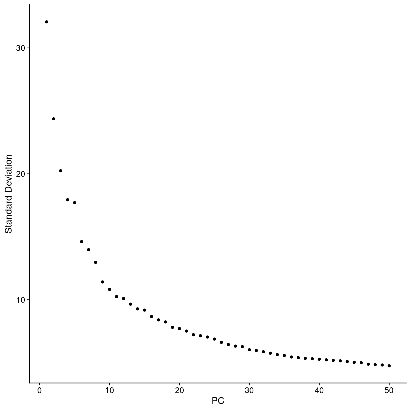
In this plot, we could arbitrarily choose a number along the x-axis that looks like a sharp change in the variance from one PC to the next, that is, an “elbow”, which indicates diminishing explained variance. While this approach is a common recommendation in in tutorials, the choice of where the point of the “elbow” is not always obvious, and this plot is no different.
An algorithmic approach
Instead of choosing based on the elbow plot by sight alone, we can try to quantify our choice algorithmically. Here we create a function to return a recommended PC based on two possible metrics ( (A) cumulative variation or (B) above a minimum step size). We can apply a version of this function that was borrowed from HBC training materials to our data to help select a good starting point for the number of PCs to include for clustering.
# -------------------------------------------------------------------------
# Estimate the number of PCs to use for clustering with a function
check_pcs = function(so, reduction) {
    # quantitative check for number of PCs to include
    pct = so@reductions[[reduction]]@stdev / sum(so@reductions[[reduction]]@stdev) * 100
    cum = cumsum(pct)
    co1 = which(cum > 90 & pct < 5)[1]
    co2 = sort(which((pct[1:length(pct)-1] - pct[2:length(pct)]) > .1), decreasing = T)[1] + 1
    pcs = min(co1, co2)

    return(pcs)
}

# Apply function to our data
pcs = check_pcs(geo_so, 'unintegrated.sct.pca')
pcs
[1] 16Again, this number is likely a starting point and may need to be revised depending on the outcome of the downstream steps.
This function is derived from the function above; it’s useful for understanding the overall variance of the PCs as well as visualizing the two kinds of cutoffs. It returns the same recommended PCs as the original function, but also:
- prints more details
- prints a plot of the PC variance with key PCs highlighted
- returns a named list of detailed results
# -------------------------------------------------------------------------
# Define a function to estimate optimal PCs for clustering
check_pcs_advanced = function(so, reduction, print_plot=TRUE, verbose=TRUE) {
  # quantitative check for number of PCs to include
  threshold_var_cum_min = 90
  threshold_var_pct_max = 5
  threshold_step_min = 0.1
  pct = so@reductions[[reduction]]@stdev / sum(so@reductions[[reduction]]@stdev) * 100
  cum = cumsum(pct)
  co1 = which(cum > threshold_var_cum_min & pct < threshold_var_pct_max)[1]
  co2 = sort(which((pct[1:length(pct)-1] - pct[2:length(pct)]) > threshold_step_min), decreasing = T)[1] + 1
  pcs = min(co1, co2)

  plot_df <- data.frame(pc = 1:length(pct),
                        pct_var = pct,
                        cum_var = cum)
  plot_df$labels = ''
  co1_label = paste0('PC ', co1)
  co2_label = paste0('PC ', co2)
  if (co1 == co2) {
    plot_df$labels[plot_df$pc == co1] = paste0(co1_label, '\n', co2_label)
  } else {
    plot_df$labels[plot_df$pc == co1] = co1_label
    plot_df$labels[plot_df$pc == co2] = co2_label
  }


  p = ggplot(plot_df, aes(x=pc, y=cum_var, label=labels)) +
    geom_point(color="grey", alpha=1) +
    geom_text(hjust = 0, vjust=1, nudge_x=2, nudge_y=-5) +
    geom_step(data=filter(plot_df, pc<=co2), color="blue", alpha=0.6, direction='vh') +
    geom_step(data=filter(plot_df, pc>=co2), color="grey", alpha=0.6, direction='hv') +
    geom_hline(yintercept = 90, color = "red", alpha=0.6, linetype = 'dashed') +
    geom_point(data=filter(plot_df, pc==co1), aes(x=pc,y=cum_var), color='red') +
    geom_point(data=filter(plot_df, pc==co2), aes(x=pc,y=cum_var), color='blue') +
    scale_y_continuous(breaks = c(0,25,50,75,100, threshold_var_cum_min)) +
    theme_bw() +
    labs(title = 'Optimal num of PCs',
         x = 'Principal Component',
         y = 'Cumulative percent variance')

  if (print_plot) {
          print(p)
  }

  if (verbose) {
     results = paste(
                sprintf('Reduction %s: %s PCs (total var = %s)',
                     reduction,
                     nrow(plot_df),
                     plot_df[plot_df$pc==nrow(plot_df), 'cum_var']),
                sprintf("\t%s (total var = %s) : Smallest PC that explains at least %s%% total variance",
                     co1_label,
                     round(plot_df[plot_df$pc==co1, 'cum_var'], 2),
                     threshold_var_cum_min),
                sprintf("\t%s (total var = %s) : Largest PC with incremental variance step at least %s%%",
                      co2_label,
                      round(plot_df[plot_df$pc==co2, 'cum_var'],2),
                      threshold_step_min),
                sprintf('\tRecommended num of PCs: %s', pcs),
                sep='\n')
      message(results)
  }

  return(list(recommended_pcs=pcs, plot=p, co1=co1, co2=co2, df=plot_df))
}
# -------------------------------------------------------------------------
# Apply function to our data
alt_pcs = check_pcs_advanced(geo_so, 'unintegrated.sct.pca')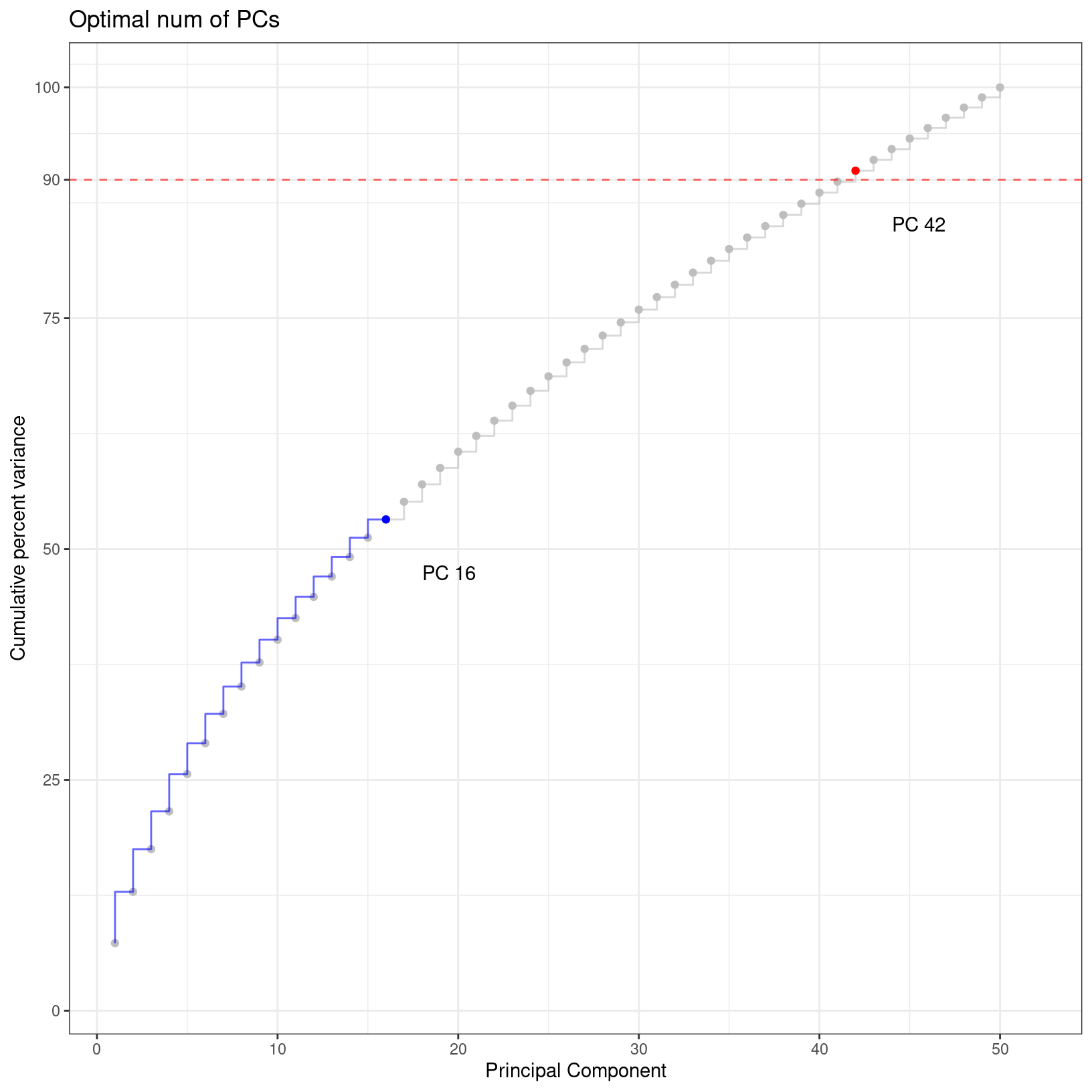
Reduction unintegrated.sct.pca: 50 PCs (total var = 100)
    PC 42 (total var = 90.98) : Smallest PC that explains at least 90% total variance
    PC 16 (total var = 53.21) : Largest PC with incremental variance step at least 0.1%
    Recommended num of PCs: 16
# -------------------------------------------------------------------------
# Save plot of PCs
ggsave(filename = 'results/figures/optimal_pcs.png',
plot=alt_pcs$plot,
width = 8, height = 8, units = 'in')
rm(alt_pcs)
gc() used (Mb) gc trigger (Mb) max used (Mb)
Ncells 9981416 533.1 17984245 960.5 17984245 960.5
Vcells 381235071 2908.6 1062319855 8104.9 1314242571 10026.9Again, this number is likely a starting point and may need to be revised depending on the outcome of the downstream steps.
While outside the scope of this workshop, there are community efforts to develop more sophisticated methods to select an appropriate number of PCs; here are a few popular approaches:
Setting PC parameter value
For this dataset, we are expecting a diversity of cell types and cell
populations that mediate wound healing, but also an aberrant transition
to bone. Based on some “behind the scenes” testing, for the purposes of
the workshop we’ll set the number of PCs to be used for clustering to
10 instead of the 16 suggested using the algorithmic
approach.
# -------------------------------------------------------------------------
# Based some behind the scenes testing, we'll modify the number of PCs to use for clustering
pcs = 10
Again, in a full analysis workflow, our selection at this step can be
more of a starting point for further iterations than a final decision
both at this stage and after attempting to assign cell-type labels. In
the exercises, you’ll have an opportunity to try clustering with fewer
or more PCs than we are using here to see the impact of this parameter
and related parameters on the clustering results.
Clustering
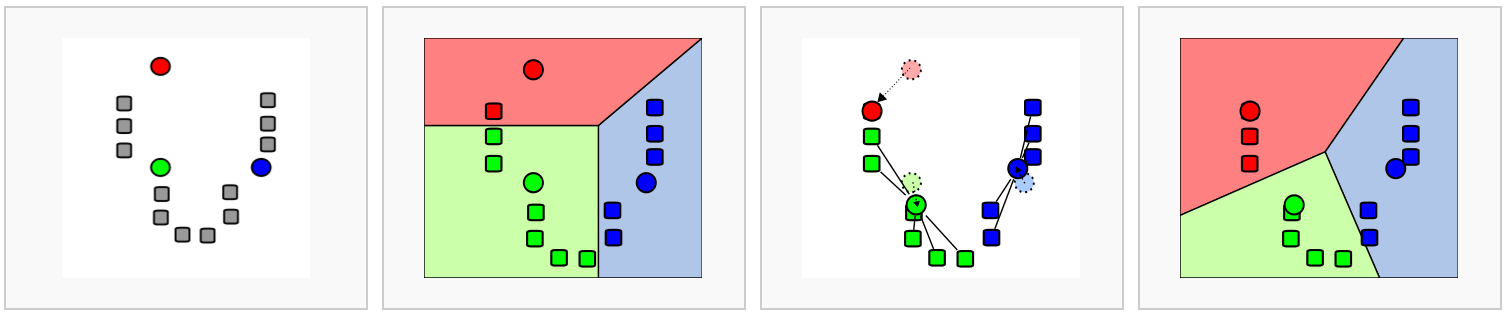
Seurat uses a graph-based clustering approach to assign cells to clusters using a distance metric based on the previously generated PCs, with improvements based on work by (Xu and Su 2015) and CyTOF data (Levine et al. 2015) implemented in Seurat v3 and v5 and building on the initial strategies for droplet-based single-cell technology (Macosko et al. 2015) (Satija Lab tutorial). A key aspect of this process is that while the clusters are based on similarity of expression between the cells, the clustering is based on the selected PCs and not the full data set.
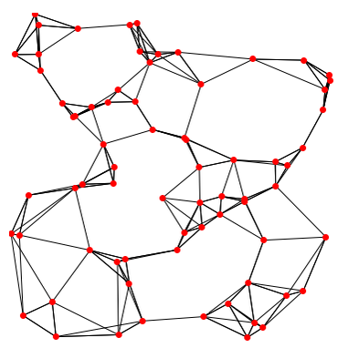
To briefly summarize, cells are embedded in a k-nearest neighbors (kNN) graph (illustrated above) based on “the euclidean distance in PCA space” between the cells and the edge weights between any two cells (e.g. their “closeness”) is refined based on Jaccard similarity (HBC training materials).
Additional context and sources for graph-based clustering
Cambridge Bioinformatics’ Analysis of single cell RNA-seq data course materials, the source of the image above, delves into kNN and other graph based clustering methods in much greater detail, including outlining possible downsides for these methods. To described kNN, we have also drawn from the Ho Lab’s description of this process for Seurat v3 as well as the HBC materials on clustering and the OSCA book’s more general overview of graph based clustering, which also describes the drawbacks for these methods.This process is performed with the FindNeighbors() command, using the number of principal components we selected in the previous section.
The second step is to iteratively partition the kNN graph into
“cliques” or clusters using the Louvain modularity optimization
algorithm (for the default parameters), with the “granularity” of the
clusters set by a resolution parameter (Satija Lab tutorial).
We’ll use the FindClusters() function, selecting a resolution of
0.4 to start, although we could also add other resolutions
at this stage to look at in later steps. See Waltman and Jan van Eck (2013) for the underlying
algorithms.
Again, how a “cell type” or “subtype” should be defined for your data is important to consider in selecting a resolution - we’d start with a higher resolution for smaller/more rare clusters and a lower resolution for larger/more general clusters.
Then, when we look at the meta data we should see that cluster labels have been added for each cell:
# -----------------------------------------------------------------------
# Find neighbors and clusters

# Create KNN graph for PCs with `FindNeighbors()`
geo_so = FindNeighbors(geo_so, dims = 1:pcs, reduction = 'integrated.sct.rpca')

# Then generate clusters
geo_so = FindClusters(geo_so,
                      resolution = 0.4,
                      cluster.name = 'integrated.sct.rpca.clusters')

# look at meta.data to see cluster labels
View(head(geo_so@meta.data))
Modularity Optimizer version 1.3.0 by Ludo Waltman and Nees Jan van Eck
Number of nodes: 31559
Number of edges: 1024599
Running Louvain algorithm...
Maximum modularity in 10 random starts: 0.9441
Number of communities: 18
Elapsed time: 5 seconds| orig.ident | nCount_RNA | nFeature_RNA | condition | time | replicate | percent.mt | nCount_SCT | nFeature_SCT | integrated.sct.rpca.clusters | seurat_clusters | |
|---|---|---|---|---|---|---|---|---|---|---|---|
| HODay0replicate1_AAACCTGAGAGAACAG-1 | HODay0replicate1 | 10234 | 3226 | HO | Day0 | replicate1 | 1.240962 | 6062 | 2867 | 0 | 0 |
| HODay0replicate1_AAACCTGGTCATGCAT-1 | HODay0replicate1 | 3158 | 1499 | HO | Day0 | replicate1 | 7.536416 | 4607 | 1509 | 0 | 0 |
| HODay0replicate1_AAACCTGTCAGAGCTT-1 | HODay0replicate1 | 13464 | 4102 | HO | Day0 | replicate1 | 3.112002 | 5314 | 2370 | 0 | 0 |
| HODay0replicate1_AAACGGGAGAGACTTA-1 | HODay0replicate1 | 577 | 346 | HO | Day0 | replicate1 | 1.559792 | 3877 | 1031 | 11 | 11 |
| HODay0replicate1_AAACGGGAGGCCCGTT-1 | HODay0replicate1 | 1189 | 629 | HO | Day0 | replicate1 | 3.700589 | 4166 | 915 | 0 | 0 |
| HODay0replicate1_AAACGGGCAACTGGCC-1 | HODay0replicate1 | 7726 | 2602 | HO | Day0 | replicate1 | 2.938131 | 5865 | 2588 | 0 | 0 |
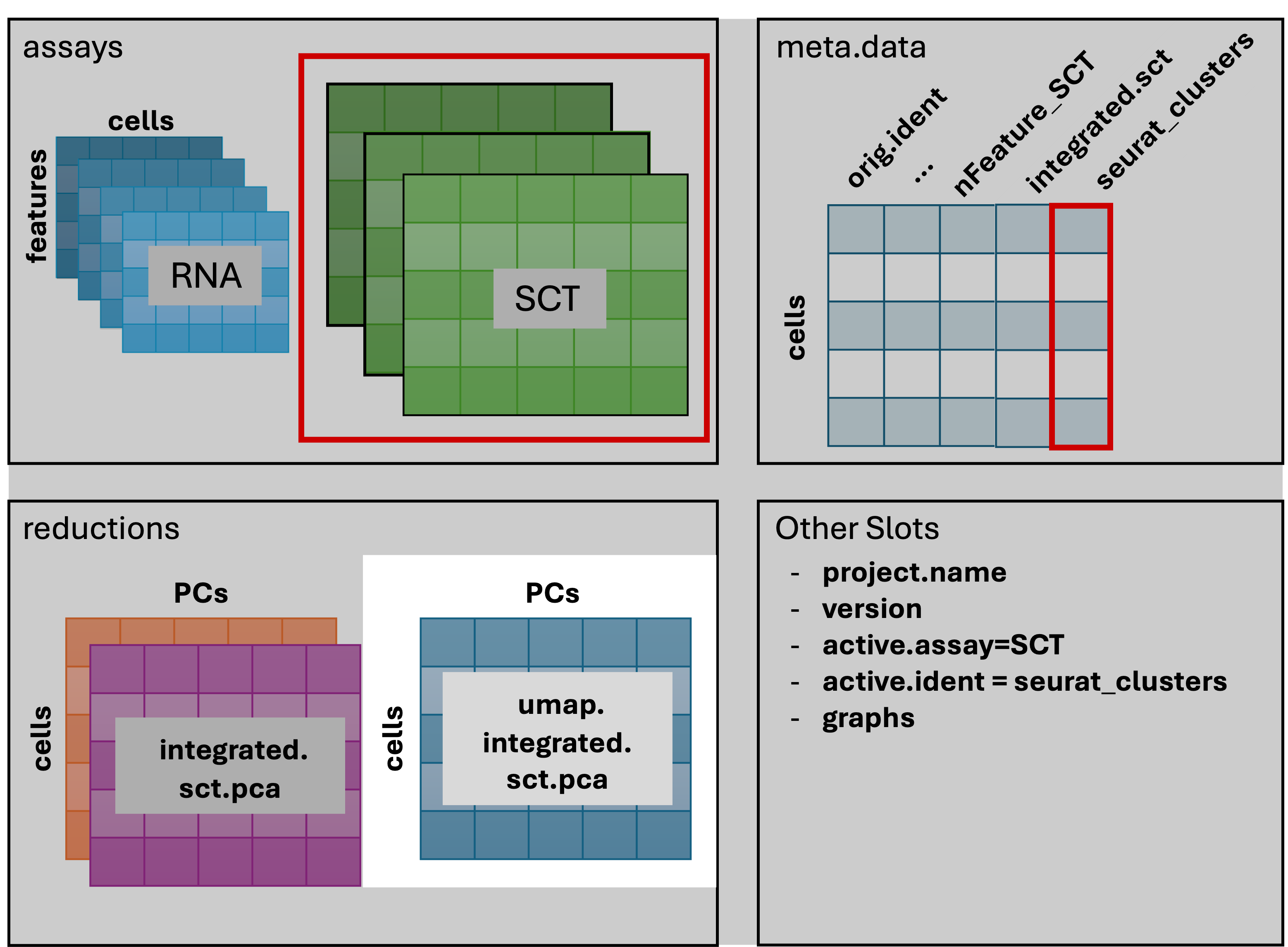
The result of FindNeighbors() adds graph information to
the graphs slot:
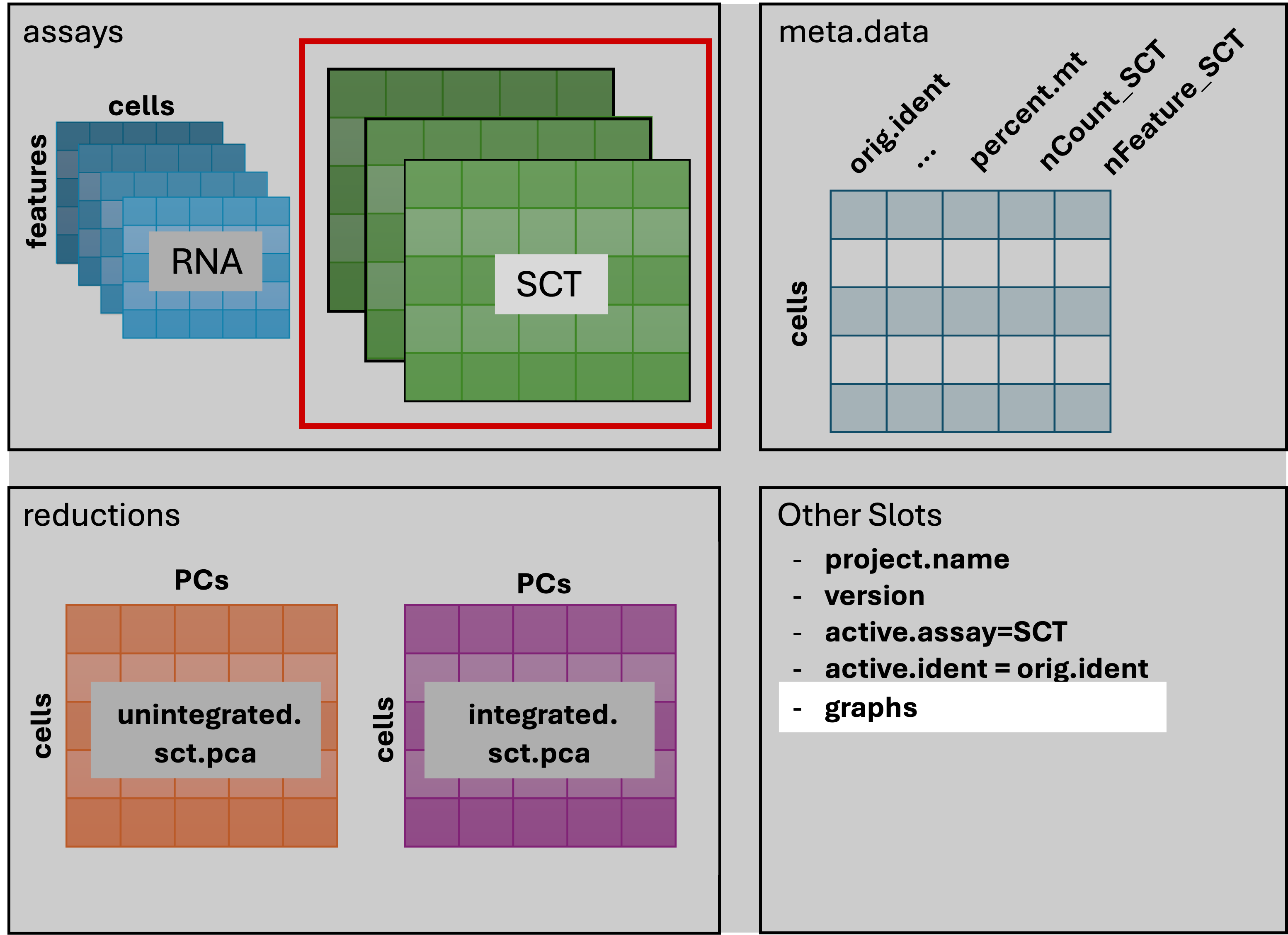
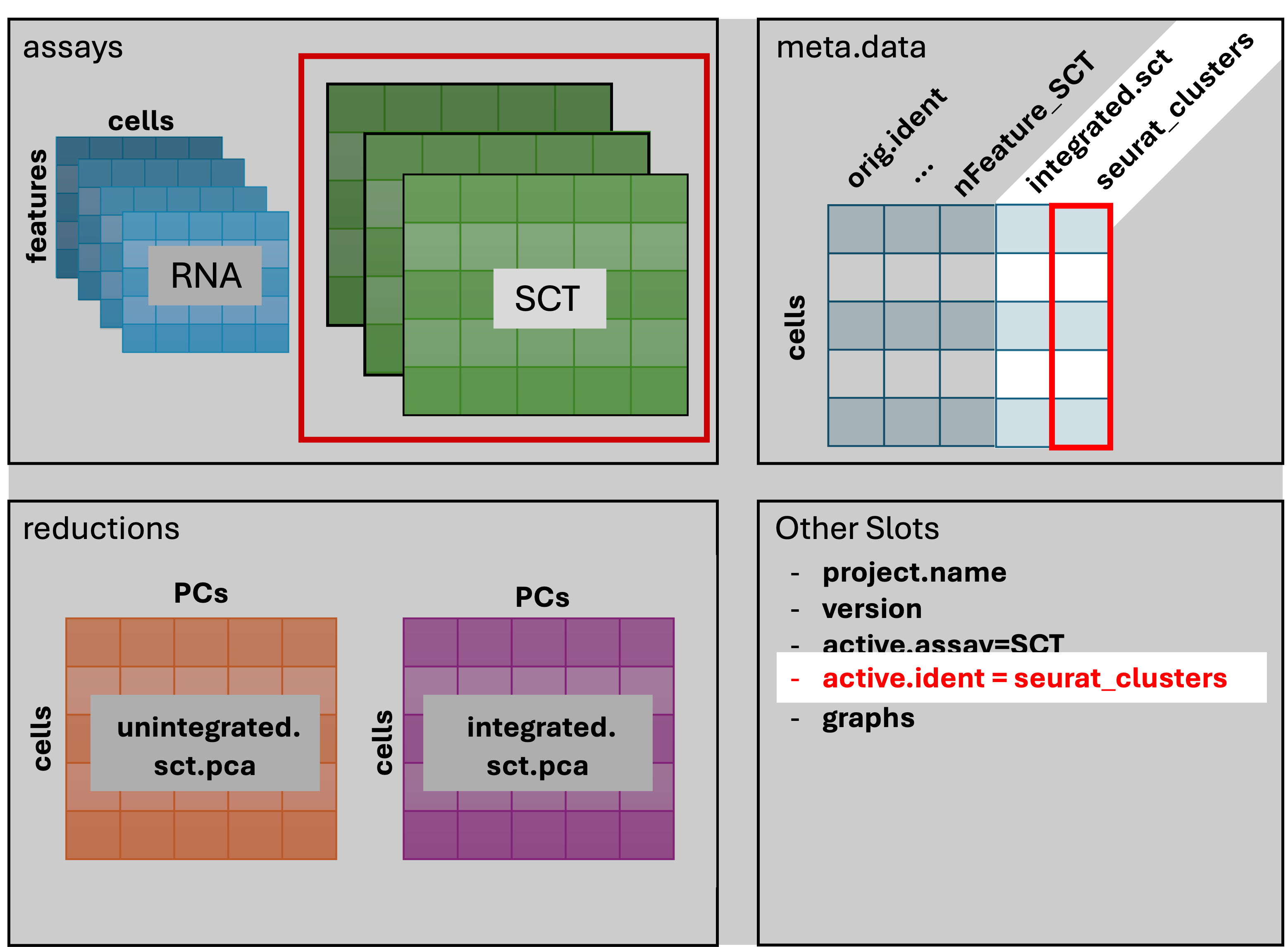
The result of FindClusters() adds two columns to the
meta.data table and changes the active.ident
to the “seurat_clusters” column. In other words, the cells now belong to
clusters rather than to their orig.ident.
Generally it’s preferable to err on the side of too many clusters, as they can be combined manually in later steps.
Resolution parameters recommendations
More details on choosing a clustering resolution
The Seurat clustering tutorial recommends selecting a resolution between 0.4 - 1.2 for datasets of approximately 3k cells, while the HBC training materials recommends 0.4-1.4 for 3k-5k cells. However, in our experience reasonable starting resolutions can be very dataset dependent.Cluster plots
To visualize the cell clusters, we can use dimensionality reduction techniques to visualize and explore our large, high-dimensional dataset. Two popular methods that are supported by Seurat are t-distributed stochastic neighbor embedding (t-SNE) and Uniform Manifold Approximation and Projection (UMAP) techniques. These techniques allow us to visualize our high-dimensional single-cell data in 2D space and see if cells grouped together within graph-based clusters co-localize in these representations (Satija Lab tutorial).
While we unfortunately don’t have time to compare and contrast tSNE, and UMAP, we would highly recommend this blog post contrasting tSNE and UMAP for illustrative examples. The Seurat authors additionally caution that while these methods are useful for data exploration, to avoid drawing biological conclusions solely based on these visualizations (source).
To start this process, we’ll use the RunUMAP() function to calculate the UMAP reduction for our data. Notice how the previous dimensionality choices carry through the downstream analysis and that the number of PCs selected in the previous steps are included as an argument.
# -------------------------------------------------------------------------
# Create UMAP reduction
geo_so = RunUMAP(geo_so,
                 dims = 1:pcs,
                 reduction = 'integrated.sct.rpca',
                 reduction.name = 'umap.integrated.sct.rpca')

# Note a third reduction has been added: `umap.integrated.sct.rpca`
geo_so
An object of class Seurat
46957 features across 31559 samples within 2 assays
Active assay: SCT (20468 features, 3000 variable features)
3 layers present: counts, data, scale.data
1 other assay present: RNA
3 dimensional reductions calculated: unintegrated.sct.pca, integrated.sct.rpca, umap.integrated.sct.rpcaRefering back to the schematic, the resulting Seurat object now has
an additional umap.integrated.sct.rpca in the
reduction slot:
Visualizing and evaluating clustering
After we generate the UMAP reduction, we can then visualize the
results using the DimPlot() function, labeling our plot by the auto
generated seurat_clusters that correspond to the most
recent clustering results generated.
At this stage, we want to determine if the clusters look fairly well separated, if they seem to correspond to how cells are grouped in the UMAP, and if the number of clusters is generally aligned with the resolution of our biological question. Again, if there are “too many” clusters that’s not necessarily a problem.
We can also look at the same UMAP labeled by time to
visually inspect if the UMAP structure corresponds to the day of
collection.
# -------------------------------------------------------------------------
# Visualize UMAP clusters: ID labels
post_integration_umap_plot_clusters =
  DimPlot(geo_so,
          group.by = 'seurat_clusters',
          label = TRUE,
          reduction = 'umap.integrated.sct.rpca') +
  NoLegend()
post_integration_umap_plot_clusters

ggsave(filename = 'results/figures/umap_integrated_sct_clusters.png',
       plot = post_integration_umap_plot_clusters,
       width = 6, height = 6, units = 'in')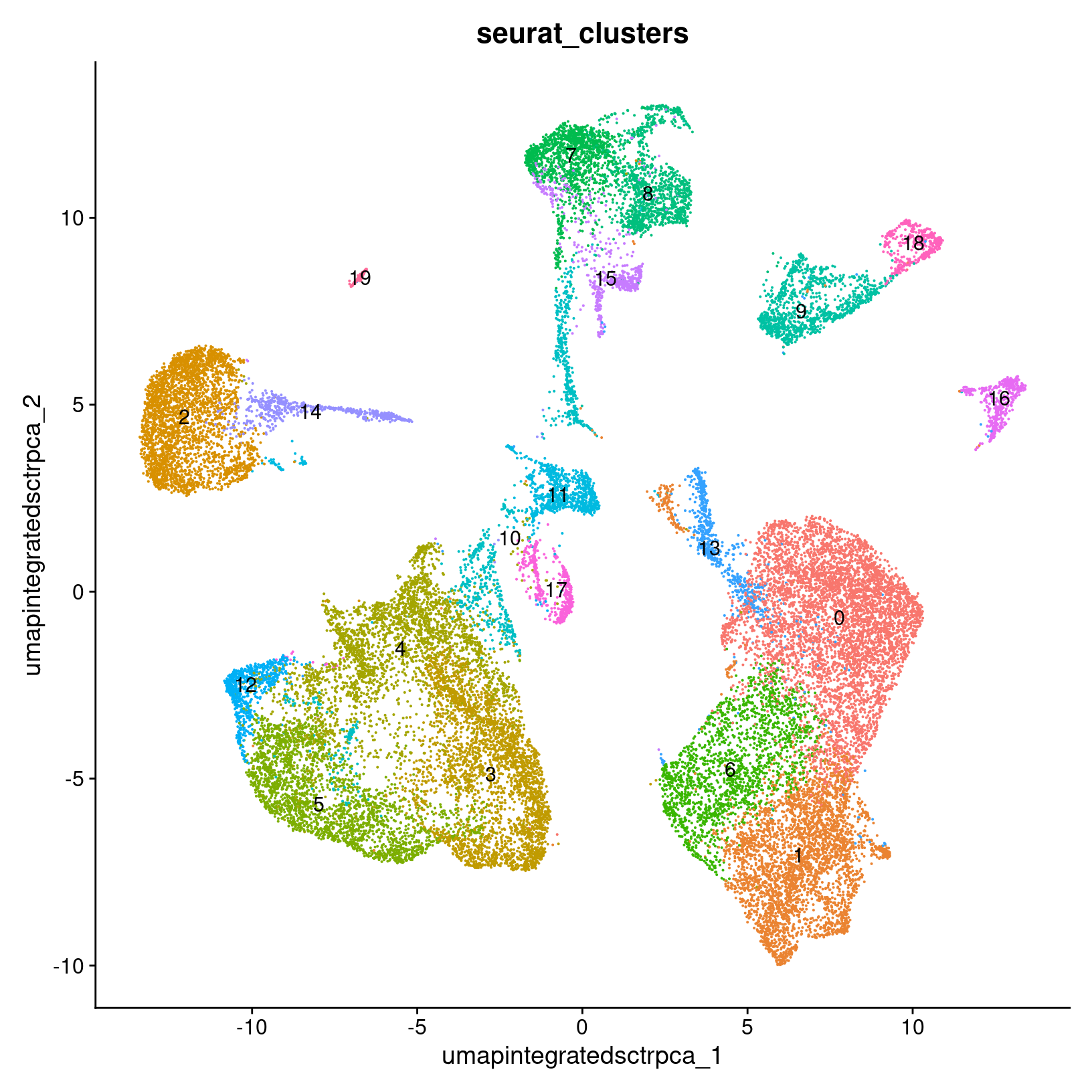
# -------------------------------------------------------------------------
# Visualize UMAP clusters: clusters with labels, split by condition
post_integration_umap_plot_split_clusters =
  DimPlot(geo_so,
          group.by = 'seurat_clusters',
          split.by = 'time',
          label = TRUE,
          reduction = 'umap.integrated.sct.rpca') +
  NoLegend()
post_integration_umap_plot_split_clusters

ggsave(filename = 'results/figures/umap_integrated_sct_split_clusters.png',
       plot = post_integration_umap_plot_split_clusters,
       width = 14, height = 6, units = 'in')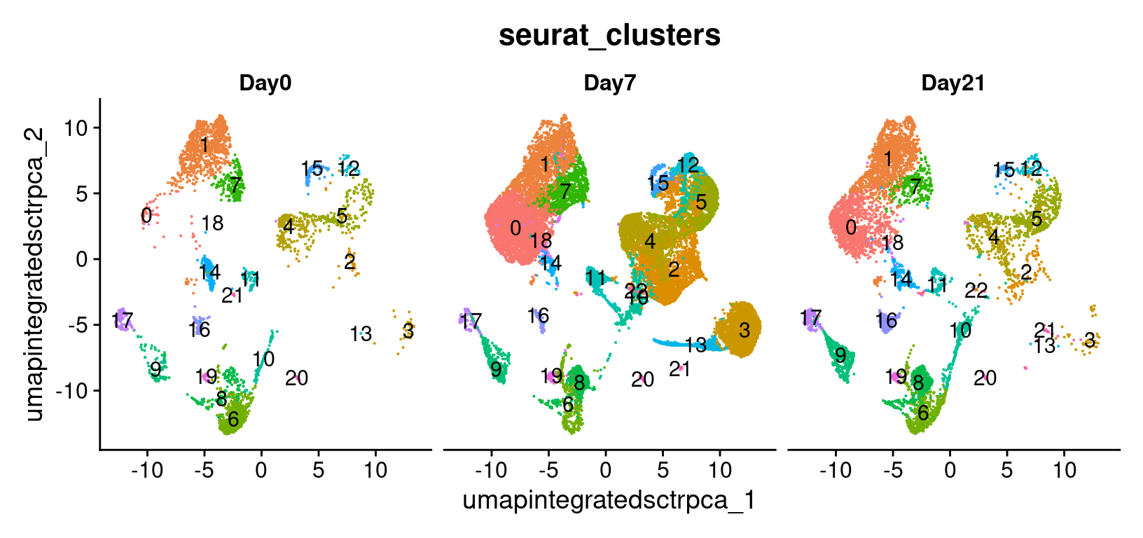
# -------------------------------------------------------------------------
# Visualize UMAP clusters: day labels
post_integration_umap_plot_day =
  DimPlot(geo_so,
          group.by = 'time',
          label = FALSE,
          combine = FALSE,
          reduction = 'umap.integrated.sct.rpca')[[1]] +
  ggtitle("Post-integration clustering, by timepoint")
post_integration_umap_plot_day

ggsave(filename = 'results/figures/umap_integrated_sct_day.png',
       plot = post_integration_umap_plot_day,
       width = 8, height = 6, units = 'in')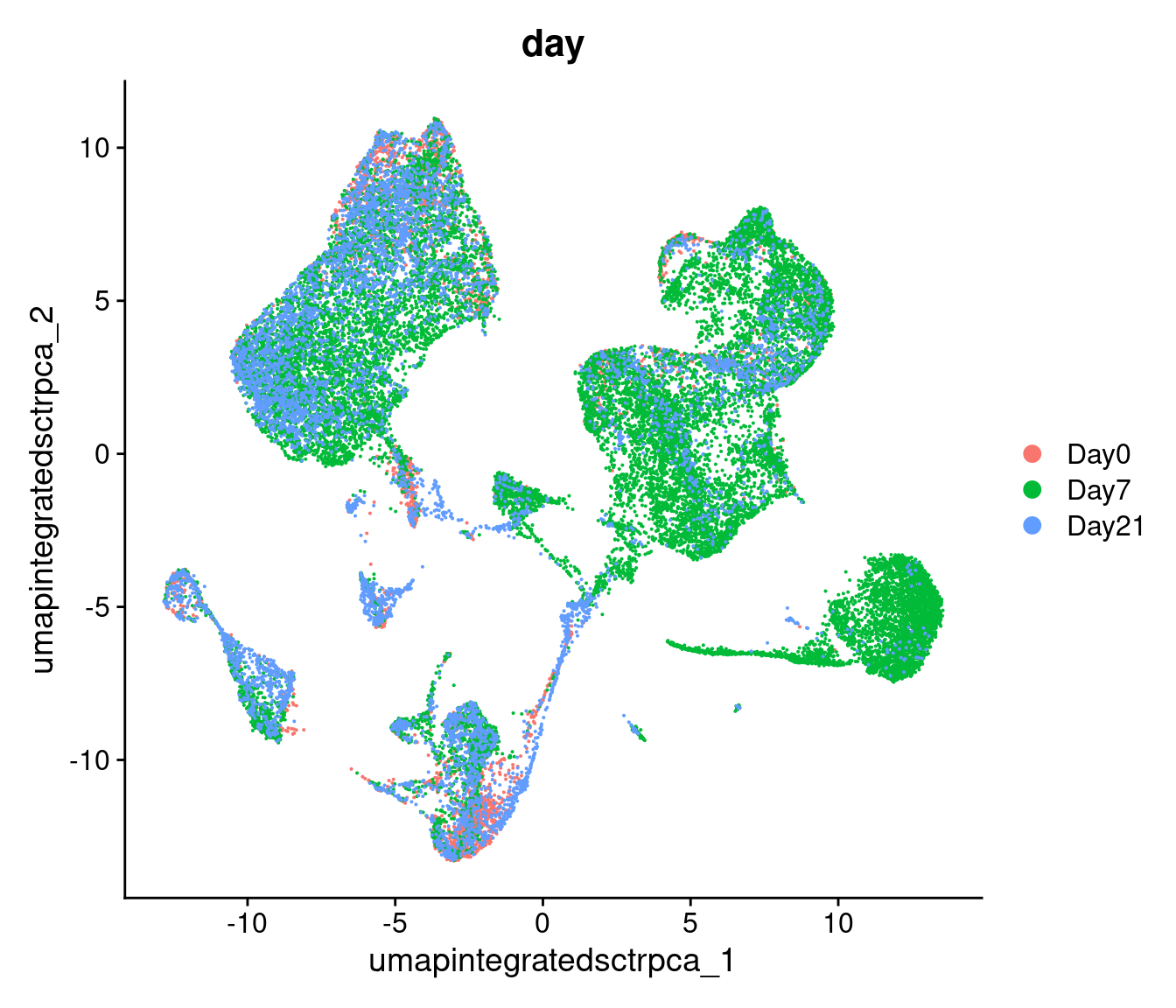
Similar to the PCA plots, the time labeled UMAP can tell
us if technical sources of variation might be driving or stratifying the
clusters, which would suggest that the normalization and integration
steps should be revisted before proceeding.
Another approach is to evaluate the number of cells per cluster using
the table() function, split by time or split
by orig.ident to see if the individual samples are driving
any of the UMAP structure:
# -------------------------------------------------------------------------
# Make tables of cell counts
clusters_counts_condition <- geo_so@meta.data %>%
  select(time, integrated.sct.rpca.clusters) %>%
  summarise(counts = n(), .by = c(time, integrated.sct.rpca.clusters)) %>%
  pivot_wider(names_from = integrated.sct.rpca.clusters,
              values_from = counts,
              names_sort = TRUE,
              values_fill = 0) %>%
  bind_rows(summarise_all(., ~if(is.numeric(.)) sum(.) else "TOTAL"))
clusters_counts_condition

# cells per cluster per sample
clusters_counts_sample <- geo_so@meta.data %>%
  select(orig.ident, integrated.sct.rpca.clusters) %>%
  summarise(counts = n(), .by = c(orig.ident, integrated.sct.rpca.clusters)) %>%
  pivot_wider(names_from = integrated.sct.rpca.clusters,
              values_from = counts,
              names_sort = TRUE,
              values_fill = 0) %>%
  bind_rows(summarise_all(., ~if(is.numeric(.)) sum(., na.rm = TRUE) else "TOTAL"))
clusters_counts_sample| time | 0 | 1 | 2 | 3 | 4 | 5 | 6 | 7 | 8 | 9 | 10 | 11 | 12 | 13 | 14 | 15 | 16 | 17 |
|---|---|---|---|---|---|---|---|---|---|---|---|---|---|---|---|---|---|---|
| Day0 | 1229 | 69 | 206 | 201 | 40 | 820 | 21 | 223 | 17 | 279 | 316 | 37 | 56 | 30 | 2 | 162 | 137 | 29 |
| Day7 | 2725 | 3079 | 2336 | 2067 | 2278 | 716 | 1506 | 638 | 1396 | 761 | 370 | 577 | 604 | 658 | 629 | 314 | 99 | 101 |
| Day21 | 1682 | 1316 | 312 | 537 | 96 | 854 | 31 | 654 | 17 | 276 | 238 | 279 | 111 | 67 | 33 | 49 | 263 | 16 |
| TOTAL | 5636 | 4464 | 2854 | 2805 | 2414 | 2390 | 1558 | 1515 | 1430 | 1316 | 924 | 893 | 771 | 755 | 664 | 525 | 499 | 146 |
| orig.ident | 0 | 1 | 2 | 3 | 4 | 5 | 6 | 7 | 8 | 9 | 10 | 11 | 12 | 13 | 14 | 15 | 16 | 17 |
|---|---|---|---|---|---|---|---|---|---|---|---|---|---|---|---|---|---|---|
| HODay0replicate1 | 358 | 15 | 68 | 63 | 20 | 229 | 7 | 52 | 7 | 72 | 43 | 10 | 17 | 11 | 1 | 48 | 22 | 10 |
| HODay0replicate2 | 158 | 10 | 34 | 36 | 5 | 146 | 8 | 35 | 0 | 55 | 81 | 5 | 8 | 7 | 1 | 13 | 24 | 3 |
| HODay0replicate3 | 438 | 28 | 64 | 58 | 4 | 246 | 2 | 78 | 4 | 76 | 89 | 11 | 16 | 5 | 0 | 59 | 41 | 3 |
| HODay0replicate4 | 275 | 16 | 40 | 44 | 11 | 199 | 4 | 58 | 6 | 76 | 103 | 11 | 15 | 7 | 0 | 42 | 50 | 13 |
| HODay7replicate1 | 688 | 468 | 572 | 555 | 755 | 250 | 566 | 134 | 538 | 71 | 83 | 0 | 174 | 212 | 0 | 68 | 41 | 38 |
| HODay7replicate2 | 607 | 1071 | 616 | 634 | 460 | 161 | 337 | 177 | 270 | 412 | 106 | 0 | 183 | 164 | 0 | 93 | 18 | 15 |
| HODay7replicate3 | 998 | 861 | 700 | 561 | 486 | 199 | 396 | 223 | 386 | 160 | 141 | 0 | 174 | 165 | 0 | 104 | 28 | 44 |
| HODay7replicate4 | 432 | 679 | 448 | 317 | 577 | 106 | 207 | 104 | 202 | 118 | 40 | 577 | 73 | 117 | 629 | 49 | 12 | 4 |
| HODay21replicate1 | 552 | 331 | 83 | 163 | 38 | 238 | 10 | 190 | 6 | 98 | 91 | 56 | 35 | 14 | 12 | 16 | 69 | 2 |
| HODay21replicate2 | 285 | 174 | 66 | 94 | 13 | 196 | 6 | 96 | 2 | 45 | 53 | 55 | 19 | 14 | 4 | 6 | 53 | 5 |
| HODay21replicate3 | 255 | 199 | 61 | 106 | 13 | 182 | 4 | 118 | 1 | 36 | 52 | 43 | 17 | 18 | 3 | 10 | 54 | 6 |
| HODay21replicate4 | 590 | 612 | 102 | 174 | 32 | 238 | 11 | 250 | 8 | 97 | 42 | 125 | 40 | 21 | 14 | 17 | 87 | 3 |
| TOTAL | 5636 | 4464 | 2854 | 2805 | 2414 | 2390 | 1558 | 1515 | 1430 | 1316 | 924 | 893 | 771 | 755 | 664 | 525 | 499 | 146 |
Comparing to unintegrated data
If we had proceeded with our filtered data and only normalized our data without doing any integration, including through the dimensionality reduction and clustering steps and then labeled the cells with their sample of origin, then we would see the following for our data:
Modularity Optimizer version 1.3.0 by Ludo Waltman and Nees Jan van Eck

Number of nodes: 31559
Number of edges: 977875

Running Louvain algorithm...
Maximum modularity in 10 random starts: 0.9522
Number of communities: 22
Elapsed time: 4 seconds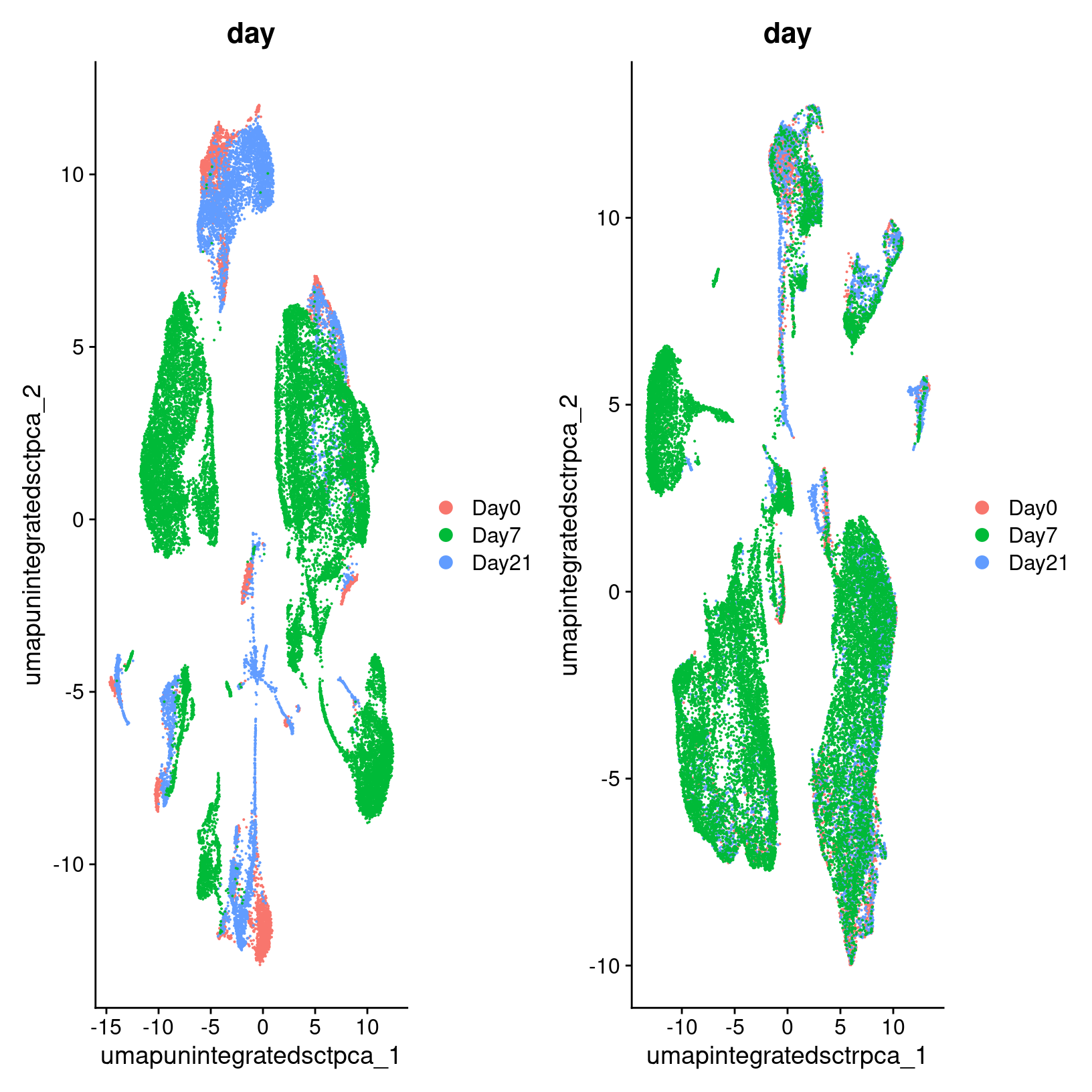
In the plot at left, we see that while there are distinct clusters, those clusters seem to stratified by day. This suggests that without integration, these batch effects could skew the biological variability in our data. While on the right, we see little stratification within our clusters which means the integration seems to have removed those batch effects.
Rewind: Pre-integration evaluation clustering and visualization (code)
Prior to integration, we could follow the same steps we’ve just run for the integrated to see if the resulting clusters tend to be determined by sample or condition (in this case, the day):
# -------------------------------------------------------------------------
geo_so = FindNeighbors(geo_so, dims = 1:pcs, assay = 'RNA', reduction = 'unintegrated.sct.pca', graph.name = c('RNA_nn', 'RNA_snn'))
geo_so = FindClusters(geo_so, resolution = 0.4, graph.name = 'RNA_snn', cluster.name = 'unintegrated.sct.clusters')
geo_so = RunUMAP(geo_so, dims = 1:pcs, reduction = 'unintegrated.sct.pca', reduction.name = 'umap.unintegrated.sct.pca')
The plots above were generated with:
# -------------------------------------------------------------------------
# Show PCA of unintegrated data
pre_integration_umap_plot_orig.ident = DimPlot(geo_so, group.by = 'orig.ident', label = FALSE, reduction = 'umap.unintegrated.sct.pca')
ggsave(filename = 'results/figures/umap_unintegrated_sct_orig.ident.png',
       plot = pre_integration_umap_plot_orig.ident,
       width = 8, height = 6, units = 'in')

pre_integration_umap_plot_day = DimPlot(geo_so, group.by = 'time', label = FALSE, reduction = 'umap.unintegrated.sct.pca')
ggsave(filename = 'results/figures/umap_unintegrated_sct_day.png',
       plot = pre_integration_umap_plot_day,
       width = 8, height = 6, units = 'in')
# -------------------------------------------------------------------------
# Remove the plot variables from the environment to manage memory
rm(pre_integration_umap_plot_orig.ident)
rm(pre_integration_umap_plot_day)
gc()
Alternative clustering resolutions
While we show a single resolution, we can generate and plot multiple resolutions iteratively and compare between them before selecting a clustering result for the next steps:
# -------------------------------------------------------------------------
resolutions = c(0.4, 0.8)

for(res in resolutions) {
    message(res)

    cluster_column = sprintf('SCT_snn_res.%s', res)
    umap_file = sprintf('results/figures/umap_integrated_sct_%s.png', res)

    geo_so = FindClusters(geo_so, resolution = res)

    DimPlot(geo_so,
            group.by = cluster_column,
            label = TRUE,
            reduction = 'umap.integrated.sct.rpca')
      + NoLegend()
    ggsave(filename = umap_file,
           width = 8, height = 7, units = 'in')
}
In the results, we’ll see multiple resolutions should now be added to the metadata slot.
# -------------------------------------------------------------------------
head(geo_so@meta.data)
Remove plot variables once they are saved
Before proceeding, we’ll remove the ggplot objects from our environment to avoid using execessive memory.
# -------------------------------------------------------------------------
# Remove plot variables from the environment to manage memory usage
plots = c("pre_integration_umap_plot_day",
          "post_integration_umap_plot_clusters",
          "post_integration_umap_plot_split_clusters",
          "post_integration_umap_plot_day")

# Only remove plots that actually exist in the environment
rm(list=Filter(exists, plots))
gc()
used (Mb) gc trigger (Mb) max used (Mb)
Ncells 9983070 533.2 17984245 960.5 17984245 960.5
Vcells 751623658 5734.5 1327939098 10131.4 1314253543 10027.0Save our progress
Before moving on to our next section, we will output our updated Seurat object to file:
# -------------------------------------------------------------------------
# Save Seurat object
saveRDS(geo_so, file = 'results/rdata/geo_so_sct_clustered.rds')
Summary
|
|
| Starting with reduced dimensionality data [PCs x cells] for all samples - cells were organized into networks and then split up to into clusters with similar expression programs, regardless of experimental condition. |
In this section we:
- Generated cluster assignments for our cells using
FindNeighbors()andFindClusters() - Evaluated our initial clusters using
RunUMAPdimensional reduction and visualization
Next steps: Marker genes
Additional links and references:
- https://pair-code.github.io/understanding-umap/
- https://duhaime.s3.amazonaws.com/apps/umap-zoo/index.html
These materials have been adapted and extended from materials listed above. These are open access materials distributed under the terms of the Creative Commons Attribution license (CC BY 4.0) , which permits unrestricted use, distribution, and reproduction in any medium, provided the original author and source are credited.
| Previous lesson | Top of this lesson | Next lesson |
|---|